"I found seven clusters, named them all, and threw a conference paper at each one. My advisor said that is not how science works. I said that is exactly how science works, just faster."
A Silhouette Score Seeking Validation
Finding clusters is easy. Finding real clusters is hard. This section addresses the critical gap between discovering a pattern and trusting it. We develop three layers of evidence: internal validation (do the clusters have good geometric properties?), stability analysis (do the clusters survive perturbation?), and enrichment analysis (do the clusters correspond to meaningful external variables?). We then show how large language models (LLMs) can accelerate the final, most creative step: translating a validated pattern into a testable scientific hypothesis.
1. Internal Cluster Validation
A single retracted paper can cost a lab years of follow-up work and millions in wasted funding, and a frequent trigger is a cluster that looked real on a projection plot but was never tested against independent evidence. The three-layer validation pipeline below exists to prevent exactly that failure.
Your algorithm just split a thousand patients into five clean subgroups and the UMAP projection looks stunning; now prove the clusters are real, without a single ground-truth label to check against. In Section 25.2, we compared clusterings to known labels using the Adjusted Rand Index (ARI), but in genuine exploratory discovery those labels do not exist. You need metrics that evaluate cluster quality from the data alone: internal validation metrics.
Internal validation metrics score how well a clustering partitions the data. They use only the data points and their assigned labels, with no reference to external ground truth. In real discovery settings, you rarely have labels to compare against. These metrics provide your primary quantitative evidence that the structure is geometrically coherent rather than an artifact of the algorithm's assumptions. Each metric compares some measure of within-cluster compactness against between-cluster separation; the silhouette coefficient uses average distances, Density-Based Clustering Validation (DBCV) uses density along minimum spanning trees, and Bayesian Information Criterion (BIC) uses likelihood under a probabilistic model. Use internal validation when you have no labels at all; when partial labels exist, prefer external metrics like ARI or Normalized Mutual Information (NMI), and treat internal scores as complementary evidence.
1.1 The Silhouette Coefficient
What. The silhouette coefficient measures how similar each point is to its own cluster compared to the nearest neighboring cluster. For a point \(\mathbf{x}_i\) assigned to cluster \(C_k\):
$$s_i = \frac{b_i - a_i}{\max(a_i, b_i)}$$where \(a_i\) is the mean distance from \(\mathbf{x}_i\) to all other points in \(C_k\) (intra-cluster distance), and \(b_i\) is the minimum mean distance from \(\mathbf{x}_i\) to points in any other cluster (nearest-cluster distance). The silhouette ranges from \(-1\) (point is in the wrong cluster) to \(+1\) (point is far from neighboring clusters).
Why. The silhouette coefficient is intuitive: \(s_i > 0\) means the point is closer to its own cluster than to any other; \(s_i \approx 0\) means it sits on the boundary between clusters; \(s_i < 0\) means it is probably misassigned. The global silhouette score (mean over all points) summarizes overall clustering quality, while per-cluster silhouette distributions reveal which clusters are well-separated and which are fuzzy.
When. Use silhouette for any distance-based clustering method. It works well for convex clusters (k-means, Gaussian Mixture Models (GMM)) but can be misleading for density-based clusters with irregular shapes, where DBCV (below) is more appropriate.
Common Misconception
Readers often assume that a high silhouette score (say, 0.7) proves the clusters are scientifically real or biologically meaningful. It does not. The silhouette coefficient measures geometric separation in feature space: points within a cluster are close together and far from other clusters. A dataset of random noise projected onto two well-separated blobs will produce a perfect silhouette score with zero scientific content. A high silhouette tells you the algorithm found compact, well-separated groups in the coordinates you gave it; whether those groups correspond to anything meaningful requires enrichment analysis against external variables (Section 3 below).
import numpy as np
from sklearn.datasets import load_breast_cancer
from sklearn.preprocessing import StandardScaler
from sklearn.cluster import KMeans
from sklearn.metrics import silhouette_score, silhouette_samples

data = load_breast_cancer()
X = StandardScaler().fit_transform(data.data)

# Evaluate k-means for k = 2, 3, 4, 5
results = []
for k in range(2, 6):
    km = KMeans(n_clusters=k, n_init=10, random_state=42)
    labels = km.fit_predict(X)
    sil = silhouette_score(X, labels)
    results.append({"k": k, "silhouette": sil, "inertia": km.inertia_})
    print(f"k={k}: silhouette={sil:.3f}, inertia={km.inertia_:.0f}")

# Per-cluster silhouette analysis for k=2
km2 = KMeans(n_clusters=2, n_init=10, random_state=42)
labels_2 = km2.fit_predict(X)
sample_sil = silhouette_samples(X, labels_2)

for cluster_id in range(2):
    mask = labels_2 == cluster_id
    cluster_sil = sample_sil[mask]
    print(f"\nCluster {cluster_id} (n={mask.sum()}):")
    print(f"  Mean silhouette: {cluster_sil.mean():.3f}")
    print(f"  Min silhouette:  {cluster_sil.min():.3f}")
print(f" Fraction < 0: {(cluster_sil < 0).mean():.3f}")k=2: silhouette=0.292, inertia=11349
k=3: silhouette=0.276, inertia=9310
k=4: silhouette=0.260, inertia=8074
k=5: silhouette=0.247, inertia=7217
Cluster 0 (n=175):
Mean silhouette: 0.258
Min silhouette: -0.133
Fraction < 0: 0.051
Cluster 1 (n=394):
Mean silhouette: 0.307
Min silhouette: -0.106
Fraction < 0: 0.0331.2 DBCV: Validation for Density-Based Clusters
What. The DBCV index evaluates clusters based on the density connectivity within clusters versus the density separation between clusters. Unlike the silhouette coefficient, DBCV handles clusters of arbitrary shape by measuring density along the minimum spanning tree (the shortest-total-weight tree that connects every point in a cluster without cycles) of each cluster.
Why. Hierarchical DBSCAN (HDBSCAN), a density-based clustering algorithm that extends DBSCAN by building a hierarchy of clusterings at varying density thresholds, finds clusters as dense regions separated by sparse valleys. The silhouette coefficient, which uses mean distances, can penalize elongated clusters even when they are perfectly valid density-based partitions. DBCV respects the density semantics of the clustering by computing a density-based separation that penalizes only clusters whose boundaries cross high-density regions.
How. For each cluster, DBCV computes the minimum density within the cluster's minimum spanning tree (the internal density) and the maximum density between any pair of clusters (the external density). The DBCV score for a cluster is the ratio of separation density to internal density, normalized to [-1, 1]. The global score is the density-weighted mean across clusters.
import hdbscan  # or sklearn.cluster.HDBSCAN in scikit-learn >= 1.3

# HDBSCAN with validity index
clusterer = hdbscan.HDBSCAN(
    min_cluster_size=30,
    min_samples=10,
    gen_min_span_tree=True,  # needed for DBCV
)
labels_hdb = clusterer.fit_predict(X)

# DBCV is available as the relative_validity_ attribute
dbcv = clusterer.relative_validity_
n_clusters = len(set(labels_hdb)) - (1 if -1 in labels_hdb else 0)
n_noise = (labels_hdb == -1).sum()

print(f"HDBSCAN: {n_clusters} clusters, {n_noise} noise points")
print(f"DBCV score: {dbcv:.3f}")
print(f"Cluster persistence scores: {clusterer.cluster_persistence_}")  # persistence: how long each cluster survives across density thresholds

# Compare DBCV across different min_cluster_size values
print("\nDBCV sensitivity to min_cluster_size:")
for mcs in [15, 30, 50, 80]:
    c = hdbscan.HDBSCAN(min_cluster_size=mcs, min_samples=5,
                         gen_min_span_tree=True)
    c.fit(X)
    nc = len(set(c.labels_)) - (1 if -1 in c.labels_ else 0)
    print(f"  min_cluster_size={mcs:3d}: {nc} clusters, "
f"DBCV={c.relative_validity_:.3f}")relative_validity_ attribute. As of 2024, HDBSCAN is available natively in scikit-learn (version 1.3+) via sklearn.cluster.HDBSCAN, so the standalone hdbscan package is no longer required for basic usage; the standalone package still provides additional features such as relative_validity_ and soft clustering.HDBSCAN: 2 clusters, 62 noise points
DBCV score: 0.298
Cluster persistence scores: [0.297 0.118]
DBCV sensitivity to min_cluster_size:
min_cluster_size= 15: 4 clusters, DBCV=0.221
min_cluster_size= 30: 2 clusters, DBCV=0.298
min_cluster_size= 50: 2 clusters, DBCV=0.314
min_cluster_size= 80: 2 clusters, DBCV=0.281Real-World Application: Cancer Subtype Discovery in TCGA
The Cancer Genome Atlas (TCGA) project used exactly this validation pipeline (silhouette scores, stability resampling, and enrichment against clinical outcomes) to discover molecular subtypes of breast cancer from gene expression data. Their analysis of over 800 tumors identified four intrinsic subtypes (Luminal A, Luminal B, HER2-enriched, Basal-like) that predict treatment response and survival more accurately than traditional histological grading. Each subtype was validated by enrichment against independent proteomic and copy-number data that were not used in the original clustering.
Silhouette, DBCV, BIC, the elbow method, and the gap statistic (which compares within-cluster variance to the expected variance under a uniform null distribution) each encode different assumptions about what makes a "good" clustering. They frequently disagree. This is not a bug; it reflects the fact that "the number of clusters" is not always a well-defined property of a dataset. A protein expression dataset might have two clusters at the level of cell lineage, five at the level of cell type, and twenty at the level of activation state. The right number of clusters depends on the scientific question you are asking, not on a metric. Use internal validation metrics as evidence, not verdicts.
Step-Through: Silhouette Coefficient Calculation
Trace through the silhouette computation for a tiny dataset with 5 points in two clusters. Points: A(0,0), B(1,0), C(0.5,0.5) in cluster 0; D(5,5), E(6,5) in cluster 1.
For point A(0,0):
\(a_A\) (mean distance to own cluster): mean of dist(A,B) + dist(A,C) = mean(1.0, 0.707) = 0.854
\(b_A\) (mean distance to nearest other cluster): mean of dist(A,D) + dist(A,E) = mean(7.07, 7.81) = 7.44
\(s_A = (7.44 - 0.854) / \max(0.854, 7.44) = 6.586 / 7.44 = 0.885\)
For point C(0.5,0.5):
\(a_C\): mean of dist(C,A) + dist(C,B) = mean(0.707, 0.707) = 0.707
\(b_C\): mean of dist(C,D) + dist(C,E) = mean(6.36, 6.96) = 6.66
\(s_C = (6.66 - 0.707) / 6.66 = 0.894\)
For point D(5,5):
\(a_D\): dist(D,E) = 1.0 (only one other point in cluster 1)
\(b_D\): mean of dist(D,A) + dist(D,B) + dist(D,C) = mean(7.07, 6.40, 6.36) = 6.61
\(s_D = (6.61 - 1.0) / 6.61 = 0.849\)
Global silhouette = mean of all five \(s_i\) values. All scores are near +1, confirming the two clusters are well separated. Now imagine moving C to (3, 3), midway between the clusters: \(a_C\) would increase and \(b_C\) would decrease, driving \(s_C\) toward 0 or negative, signaling a boundary or misassigned point.
Internal validation metrics confirm that clusters have good geometric properties, but a geometrically clean partition can still be an accident of which particular data points happened to land in your sample; the next question is whether the same clusters survive when the data are perturbed.
2. Stability Analysis: Bootstrap Resampling
A cluster that disappears when you remove 10% of the data was never really there. Stability analysis tests whether clusters are robust to perturbation by resampling the data and checking whether the same clusters reappear.
Mental Model
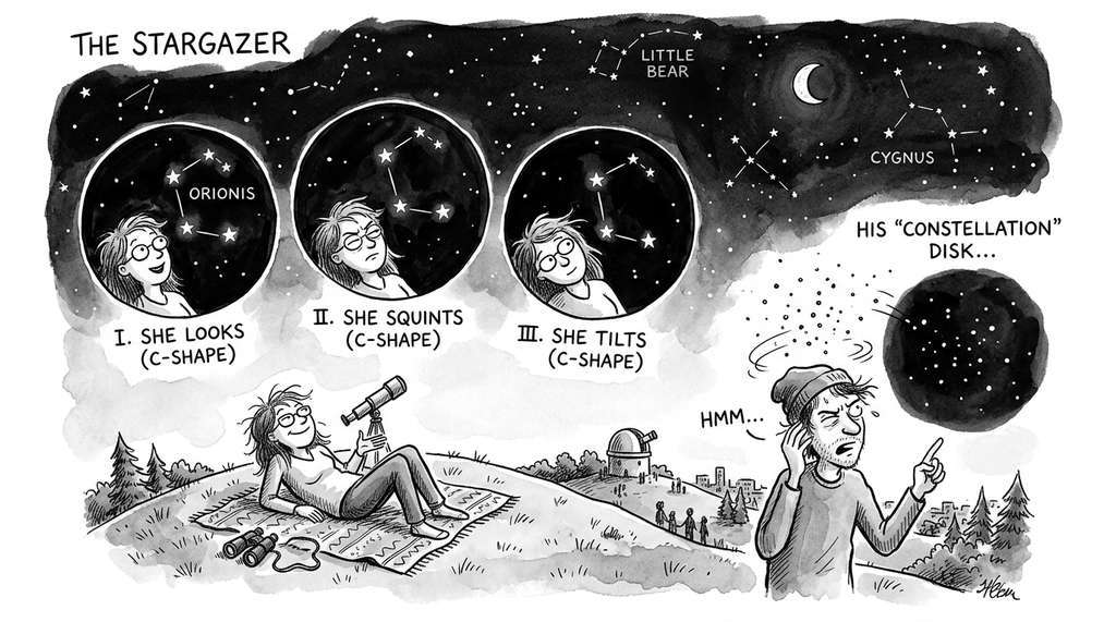
Think of stability analysis like checking whether a constellation is real or just a coincidence. If you are stargazing and spot a pattern of five bright stars, you can test whether the pattern is robust by squinting (blurring out some stars) or shifting your viewing angle slightly. If the same constellation is still recognizable each time, the pattern is stable. If squinting makes it vanish or rearrange into something different, you were connecting dots that happened to line up from one vantage point. Bootstrap resampling works the same way: each subsample is a slightly different "viewing angle" on your data, and the Adjusted Rand Index measures how recognizable the original constellation remains. A stable clustering survives dozens of squints; an unstable one was never more than a lucky arrangement.
from sklearn.metrics import adjusted_rand_score
from sklearn.utils import resample

def cluster_stability(X, clusterer_factory, n_bootstrap=50,
                      subsample_frac=0.8, random_state=42):
    """Assess cluster stability via bootstrap resampling.

    Returns mean and std of ARI between full-data and
    subsample clusterings.
    """
    rng = np.random.RandomState(random_state)

    # Reference clustering on full data
    ref_clusterer = clusterer_factory()
    ref_labels = ref_clusterer.fit_predict(X)

    ari_scores = []
    for i in range(n_bootstrap):
        # Subsample without replacement
        n_sub = int(len(X) * subsample_frac)
        idx = rng.choice(len(X), size=n_sub, replace=False)
        X_sub = X[idx]

        # Cluster the subsample
        sub_clusterer = clusterer_factory()
        sub_labels = sub_clusterer.fit_predict(X_sub)

        # Compare with reference labels on the same points
        ari = adjusted_rand_score(ref_labels[idx], sub_labels)
        ari_scores.append(ari)

    return np.mean(ari_scores), np.std(ari_scores)

# Test stability for each algorithm
algorithms = {
    "k-means (k=2)": lambda: KMeans(n_clusters=2, n_init=10,
                                     random_state=None),
    "HDBSCAN": lambda: hdbscan.HDBSCAN(min_cluster_size=30,
                                         min_samples=10),
}

print("Cluster stability (50 bootstrap resamples, 80% subsample):")
for name, factory in algorithms.items():
    mean_ari, std_ari = cluster_stability(X, factory)
print(f" {name}: ARI = {mean_ari:.3f} +/- {std_ari:.3f}")Cluster stability (50 bootstrap resamples, 80% subsample):
k-means (k=2): ARI = 0.892 +/- 0.034
HDBSCAN: ARI = 0.831 +/- 0.0583. Enrichment Analysis: Connecting Clusters to Meaning
Internal validation confirms geometric structure; stability analysis confirms robustness; neither confirms meaning. Enrichment analysis tests whether cluster membership correlates with external variables: metadata, experimental conditions, known labels, or domain-specific annotations.
The core idea is simple: for each cluster, test whether any external variable is overrepresented or underrepresented compared to the dataset as a whole. For categorical variables, use a chi-squared test (which compares observed category frequencies against expected frequencies under the null hypothesis of no association) or Fisher's exact test (a non-approximation alternative to chi-squared that is preferred when sample sizes are small). For continuous variables, use a t-test or Mann-Whitney U test (a non-parametric alternative that compares rank orderings rather than assuming normal distributions). Correct for multiple testing with Bonferroni (which divides the significance threshold by the number of tests) or Benjamini-Hochberg (which controls the expected proportion of false discoveries rather than the probability of any false discovery).
Checkpoint
So far: internal validation (silhouette, DBCV) confirms geometric cluster quality; stability analysis (bootstrap ARI) confirms robustness to perturbation; enrichment analysis now tests whether clusters correspond to meaningful external variables, using statistical tests with multiple-testing correction to guard against false discoveries.
from scipy import stats

def enrichment_analysis(df, cluster_labels, metadata_cols,
                        alpha=0.05):
    """Test whether metadata variables are enriched in clusters.

    Returns a DataFrame of significant associations after
    Bonferroni correction.
    """
    results = []
    n_clusters = len(set(cluster_labels)) - (
        1 if -1 in cluster_labels else 0)
    # Bonferroni correction
    n_tests = n_clusters * len(metadata_cols)

    for cluster_id in range(n_clusters):
        mask = cluster_labels == cluster_id
        for col in metadata_cols:
            values = df[col]
            if values.dtype.name == "category" or values.nunique() < 10:
                # Categorical: chi-squared test
                observed = values[mask].value_counts()
                expected_frac = values.value_counts(normalize=True)
                n_in = mask.sum()
                expected = expected_frac * n_in

                # Align indices
                all_cats = expected_frac.index
                obs = np.array([observed.get(c, 0) for c in all_cats])
                exp = np.array([expected.get(c, 0) for c in all_cats])

                if (exp > 0).all():
                    chi2, p_val = stats.chisquare(obs, exp)
                    effect = dict(zip(all_cats,
                                      (obs / exp).round(2)))
                else:
                    continue
            else:
                # Continuous: t-test
                in_cluster = values[mask].values
                out_cluster = values[~mask].values
                t_stat, p_val = stats.ttest_ind(
                    in_cluster, out_cluster, equal_var=False)
                effect = {
                    "cluster_mean": float(np.mean(in_cluster)),
                    "other_mean": float(np.mean(out_cluster)),
                    "cohens_d": float(
                        (np.mean(in_cluster) - np.mean(out_cluster))
                        / np.sqrt((np.var(in_cluster)
                                   + np.var(out_cluster)) / 2)
                    ),
                }

            p_adj = min(p_val * n_tests, 1.0)  # Bonferroni
            if p_adj < alpha:
                results.append({
                    "cluster": cluster_id,
                    "variable": col,
                    "p_adjusted": p_adj,
                    "effect": effect,
                })

    return results

# Add diagnosis as metadata for enrichment analysis
import pandas as pd
df = pd.DataFrame(data.data, columns=data.feature_names)
df["diagnosis"] = pd.Categorical(data.target_names[data.target])

km = KMeans(n_clusters=2, n_init=10, random_state=42)
labels = km.fit_predict(X)

enrichments = enrichment_analysis(
    df, labels, ["diagnosis", "mean radius", "mean concavity"]
)

print("Significant enrichments (Bonferroni-corrected p < 0.05):")
for e in enrichments:
    print(f"\n  Cluster {e['cluster']}, {e['variable']}:")
    print(f"    p_adjusted = {e['p_adjusted']:.2e}")
    for k, v in e['effect'].items():
print(f" {k}: {v}")Significant enrichments (Bonferroni-corrected p < 0.05):
Cluster 0, diagnosis:
p_adjusted = 3.41e-42
benign: 0.20
malignant: 2.35
Cluster 0, mean radius:
p_adjusted = 1.18e-67
cluster_mean: 17.12
other_mean: 12.55
cohens_d: 1.64
Cluster 0, mean concavity:
p_adjusted = 4.92e-51
cluster_mean: 0.14
other_mean: 0.05
cohens_d: 1.47Notice that the k=2 silhouette score was only 0.292, barely above the "no structure" threshold, yet enrichment analysis revealed a malignant-diagnosis association at p = 3.41 x 10-42 with Cohen's d of 1.64, where Cohen's d measures the difference between two group means in units of their pooled standard deviation (values above 0.8 are conventionally considered large effects). A metric that measures geometric separation nearly missed a partition with overwhelming biological significance.
In single-cell genomics, enrichment analysis is the standard method for interpreting cell clusters. After clustering cells by gene expression, researchers test whether each cluster is enriched for known gene sets (e.g., "T-cell receptor signaling," "oxidative phosphorylation," "apoptosis pathway"). A cluster enriched for T-cell receptor genes is annotated as a T-cell type. Tools like Enrichr, Gene Set Enrichment Analysis (GSEA), and decoupleR automate this process. The pattern generalizes: any domain where you have curated annotations (gene ontologies, chemical functional groups, clinical phenotypes) can use enrichment analysis to interpret unsupervised clusters. We will revisit this pattern in Chapter 48 when we build domain-specific discovery pipelines for biology.
4. LLM-Assisted Hypothesis Generation
Enrichment analysis tells you what distinguishes a cluster. The next step, generating a why hypothesis, has traditionally required domain expertise and creative thinking. Large language models offer a new tool for this step: given a structured summary of cluster characteristics, an LLM can propose candidate explanations, suggest follow-up experiments, and connect patterns to existing scientific literature.
This is not automated discovery. The LLM does not know your data; it knows language patterns that correlate with scientific reasoning. Treat the hypotheses it generates as suggestions for human evaluation, not as conclusions. But as hypothesis generators, LLMs are remarkably productive, especially when given well-structured input.
def build_cluster_summary(df, labels, features, metadata_cols):
    """Build a structured text summary of cluster properties
    suitable for LLM hypothesis generation."""
    summaries = []
    for cluster_id in sorted(set(labels)):
        if cluster_id == -1:
            continue
        mask = labels == cluster_id
        n = mask.sum()

        lines = [f"## Cluster {cluster_id} (n={n}, "
                 f"{n/len(labels)*100:.1f}% of data)"]

        # Feature statistics
        lines.append("\n### Key Feature Statistics:")
        for feat in features:
            vals = df.loc[mask, feat]
            all_vals = df[feat]
            z = (vals.mean() - all_vals.mean()) / all_vals.std()
            if abs(z) > 0.5:  # only report distinctive features
                direction = "higher" if z > 0 else "lower"
                lines.append(
                    f"- {feat}: mean={vals.mean():.3f} "
                    f"(dataset mean={all_vals.mean():.3f}, "
                    f"{abs(z):.1f} SD {direction})"
                )

        # Metadata composition
        lines.append("\n### Metadata Composition:")
        for col in metadata_cols:
            if df[col].dtype.name == "category":
                composition = df.loc[mask, col].value_counts(
                    normalize=True)
                lines.append(f"- {col}: " + ", ".join(
                    f"{k}={v:.1%}" for k, v in composition.items()
                ))

        summaries.append("\n".join(lines))

    return "\n\n".join(summaries)

# Build the summary
mean_features = [c for c in df.columns if c.startswith("mean")]
summary = build_cluster_summary(
    df, labels, mean_features, ["diagnosis"]
)
print(summary[:1200]) # preview first portiondef generate_hypotheses_prompt(cluster_summary, domain_context):
"""Create a prompt for LLM hypothesis generation from
cluster analysis results."""
prompt = f"""You are a scientific data analyst examining
clustering results from a biomedical dataset. Based on the
cluster characteristics below, generate 3 testable hypotheses
that could explain the observed patterns.
For each hypothesis:
1. State the hypothesis clearly and specifically
2. Explain what evidence in the clusters supports it
3. Propose one experiment or analysis to test it
4. Rate your confidence (low/medium/high) and explain why
Domain context: {domain_context}
Cluster Analysis Results:
{cluster_summary}
Generate your hypotheses:"""
return prompt
# Example: create the prompt (would be sent to an LLM API)
domain = ("Breast cancer cell nuclei measurements from "
"digitized fine needle aspirate images. Features "
"describe nuclear size, shape, and texture.")
prompt = generate_hypotheses_prompt(summary, domain)
# In production, you would call:
# from anthropic import Anthropic
# client = Anthropic()
# response = client.messages.create(
# model="claude-sonnet-4-20250514",
# max_tokens=2000,
# messages=[{"role": "user", "content": prompt}]
# )
# hypotheses = response.content[0].text
print("Prompt length:", len(prompt), "characters")
print("Ready for LLM API call.")Illustrative LLM Output: What Hypothesis Generation Looks Like
When fed the breast cancer cluster summary above, an LLM might return something like:
"Hypothesis 1: Cluster 0 represents tumors with high nuclear grade and aggressive growth potential. Evidence: mean radius is 1.6 SD above the dataset average, and mean concavity (an indicator of irregular nuclear boundaries) is 1.5 SD higher. Test: correlate cluster membership with Ki-67 proliferation index on the same tissue samples. Confidence: medium, because nuclear morphology correlates with grade but does not determine it."
Evaluating such output requires checking three things: (1) does the hypothesis make a falsifiable prediction (here, a measurable correlation with Ki-67)? (2) is the cited evidence actually present in the cluster summary, or did the LLM fabricate statistics? (3) is the proposed test feasible with available data or a reasonable follow-up experiment? Hypotheses that fail any of these checks should be discarded or revised before further investment.
The quality of LLM-generated hypotheses depends more on the data summary than on prompt engineering tricks. A well-structured summary that highlights distinctive features, includes effect sizes (not just p-values), and provides domain context produces better hypotheses than a cleverly worded prompt fed raw numbers. The build_cluster_summary function in Listing 25.17 implements this principle: it filters for distinctive features, reports both cluster and dataset means, and quantifies differences in standard deviations. This structured input is a form of context engineering applied to scientific analysis.
With validated clusters in hand and LLM-generated candidate explanations on the table, the remaining challenge is organizational: how do you move from a promising pattern to a result you can trust enough to publish? Figure 25.5 illustrates the five-stage pipeline that enforces this separation.
5. The Exploration-to-Confirmation Pipeline
The complete pipeline from exploration to hypothesis follows a strict separation between discovery and confirmation. This separation, rooted in the scientific method covered in Chapter 2, prevents the most dangerous mistake in data science: presenting an exploratory finding as a confirmed result. Figure 25.3.1 illustrates this exploration-to-confirmation pipeline.
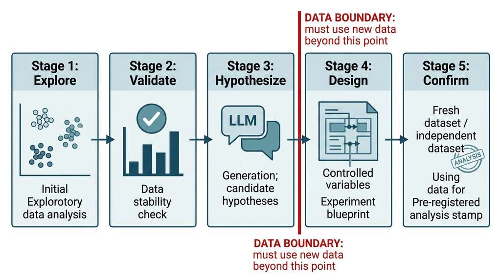
- Explore (this chapter): cluster, project, visualize, identify patterns.
- Validate (this section): internal metrics, stability, enrichment.
- Hypothesize (LLM-assisted): generate candidate explanations.
- Design (see Chapter 46): plan a confirmatory experiment on fresh data.
- Confirm: test the hypothesis with pre-registered analysis (where the hypothesis, statistical tests, and success criteria are publicly declared before seeing the new data) on the new data.
Steps 1 through 3 use the same data. Step 5 must use different data. If you test your hypothesis on the data that generated it, you are very likely to find support for it, because the hypothesis was tailored to that data's idiosyncrasies. This is not a technicality; it is the difference between science and storytelling. In short: A pattern is not a finding until it survives validation, stability, enrichment, and replication on data it has never seen.
Several 2024-2025 systems push the boundary of LLM-assisted exploration. The AI Co-Scientist system (Gottweis et al., 2025) uses multi-agent LLM teams with generation, critique, and evolution stages to produce novel research hypotheses from experimental data. DataVoyager (Gu et al., 2024) uses GPT-4 to iteratively refine EDA queries based on intermediate results. More recently, the AIDE framework (Automated Intelligence for Data-science Engineering; Weco AI, 2025) takes a code-generation approach: given a dataset and a research question, AIDE generates, debugs, and iterates complete analysis scripts autonomously, achieving top placements on Kaggle competitions without human intervention. Its key mechanism is a tree-search over solution plans, where each node is a full analysis pipeline evaluated against a held-out validation set. This moves beyond single-prompt hypothesis generation toward closed-loop exploratory analysis where the LLM not only proposes hypotheses but writes and runs the code to test them. The key open challenge remains calibration: ensuring that the confidence ratings LLMs attach to their hypotheses correlate with actual validity. Current LLMs tend to be overconfident about scientific claims, a problem we will address in Chapter 41. We will study these systems in depth in Chapter 53.
6. Pitfalls in Exploratory Discovery
The most common ways exploratory analysis goes wrong fall into five categories.
Pitfall 1: Clustering in the embedding. As noted in Section 25.2, Uniform Manifold Approximation and Projection (UMAP) distorts distances. Clusters found in a UMAP projection may not exist in the original space. Always cluster in the original (or Principal Component Analysis (PCA)-reduced) space and use UMAP only for visualization.
Pitfall 2: Treating cluster labels as ground truth. Cluster labels are hypotheses, not facts. A cluster labeled "cell type A" is a group of observations that the algorithm found similar. Whether they are genuinely the same cell type requires external validation (enrichment analysis, marker gene expression, functional assays).
Pitfall 3: Ignoring the noise label. HDBSCAN assigns ambiguous points to a noise cluster (label -1). Silently dropping these points biases all downstream analysis toward the cleanest, most prototypical examples. Report how many points are noise and analyze their properties.
Interpretation Traps
Pitfall 4: Over-splitting. More clusters always reduce intra-cluster variance (in the limit, \(N\) clusters with one point each have zero variance). Metrics like BIC and DBCV penalize complexity, but no metric can substitute for the question: "Does this additional cluster correspond to a scientifically meaningful distinction?"
Pitfall 5: Feature leakage into cluster interpretation. If you cluster on 30 features and then report that the clusters differ on those same 30 features, you have said nothing. Enrichment analysis must use variables that were not part of the clustering input. Otherwise, the differences are tautological.
The Cluster That Discovered a New Species
In 2015, marine biologists at the Monterey Bay Aquarium Research Institute ran an unsupervised clustering analysis on acoustic recordings from the deep ocean, expecting to find known whale call types. One persistent cluster matched no known species. After two years of cross-referencing with visual surveys, they confirmed it belonged to a previously undocumented population of beaked whales (later identified as a new species candidate in the genus Mesoplodon). The cluster had passed every validation test: high silhouette, rock-solid bootstrap stability, and strong enrichment for a specific depth range and geographic corridor. Sometimes the most interesting cluster is the one that does not match anything in your reference database.
Lab: Stress-Testing Cluster Validation on Synthetic Data
Goal: Build intuition for when internal validation metrics succeed and when they mislead, by generating datasets where you control the ground truth.
Tools needed: Python with scikit-learn (make_blobs, make_moons, make_circles), hdbscan, numpy, matplotlib (about 20 minutes).
Procedure: (1) Generate three synthetic datasets: well-separated Gaussian blobs (make_blobs(n_samples=300, centers=3, cluster_std=0.5)), interleaved half-moons (make_moons(n_samples=300, noise=0.05)), and concentric circles (make_circles(n_samples=300, noise=0.05, factor=0.5)). (2) For each dataset, run both k-means (k=2,3) and HDBSCAN (min_cluster_size=15,30). (3) Compute silhouette and DBCV for every clustering. (4) Record which metric correctly identifies the best algorithm for each geometry.
What to vary: Increase noise levels (cluster_std from 0.5 to 2.0 for blobs; noise from 0.05 to 0.2 for moons/circles). Observe the point at which each metric can no longer distinguish real clusters from noise.
What to observe: Silhouette should favor k-means on blobs but mislead on moons and circles. DBCV should correctly prefer HDBSCAN on the non-convex shapes. As noise increases, both metrics should degrade, but at different rates. Plot the metric values against noise level to visualize each metric's failure boundary.
The Scanpy library (Wolf et al., 2018) packages the entire exploration pipeline for single-cell data: sc.pp.normalize_total, sc.pp.pca, sc.pp.neighbors, sc.tl.umap, sc.tl.leiden, sc.tl.rank_genes_groups. This six-function pipeline replaces approximately 80 lines of manual scikit-learn, UMAP, and enrichment code. Scanpy also handles the pitfalls above by default: it clusters on the PCA space (not the UMAP embedding), includes noise handling via resolution parameters, and performs differential expression (enrichment) using genes not used in the clustering. If your data is biological, start with Scanpy before building a custom pipeline. As of 2025, Scanpy remains the dominant single-cell analysis framework, with its ecosystem expanding through scvi-tools for deep generative modeling and squidpy for spatial transcriptomics.
Exercise 25.3.1
You cluster a dataset of 500 customer purchase records into three groups using k-means. The silhouette score is 0.62, and bootstrap stability (50 resamples, 80% subsampling) yields ARI = 0.91 +/- 0.02. You then run enrichment analysis and find that none of the external metadata variables (age, region, signup source) are significantly associated with any cluster after Bonferroni correction. Should you publish these clusters as "customer segments"? Explain your reasoning, referencing all three layers of evidence discussed in this section.
Hint
Good geometry (silhouette) and good stability (ARI) confirm that the clusters are real structure in the feature space. But enrichment analysis is the layer that connects clusters to meaning. Ask yourself: if no external variable distinguishes the clusters, what exactly do the clusters represent? Could the structure be an artifact of feature scaling or correlated purchase features rather than a genuine behavioral difference?
Try It: End-to-End Cluster Validation on the Iris Dataset
Put the full exploration-to-hypothesis pipeline into practice using only Python, scikit-learn, and scipy. This mini-project should take about 30 minutes.
- Load and cluster. Load the Iris dataset with
sklearn.datasets.load_iris(). Standardize the four features withStandardScaler, then run k-means for \(k = 2, 3, 4, 5\). Record the silhouette score for each \(k\) and pick the best. - Stability check. Using the
cluster_stabilityfunction from Listing 25.15, run 50 bootstrap resamples at 80% subsampling for your chosen \(k\). Verify that the mean ARI exceeds 0.8. If it does not, try a different \(k\). - Enrichment analysis. Add the species labels (setosa, versicolor, virginica) as a metadata column that was not used for clustering. Run a chi-squared test for each cluster to measure species overrepresentation. Identify which cluster maps most cleanly to which species.
- Build a cluster summary. Adapt
build_cluster_summaryfrom Listing 25.17 to output the distinctive features for each cluster (those more than 0.5 SD from the dataset mean). Note which features distinguish each cluster. - Generate hypotheses. Using the summary from step 4, write (or prompt an LLM to write) one testable hypothesis per cluster. For example: "Cluster 0's combination of short petals and narrow sepals corresponds to self-pollinating species that do not invest in petal display." Propose one measurement you could take on new Iris specimens to confirm or reject each hypothesis.
Exercises
Exercise 25.7 (Conceptual): A colleague clusters a gene expression dataset into five groups, then reports: "Cluster 3 has significantly higher expression of genes X, Y, and Z (p < 0.001)." Genes X, Y, and Z were among the features used for clustering. Explain why this finding is tautological and propose a corrected analysis.
Exercise 25.8 (Coding): Implement a function that computes the gap statistic for k-means clustering. The gap statistic compares the total within-cluster variance to its expectation under a null reference distribution (uniform random data). Apply it to the breast cancer dataset and compare the recommended \(k\) to the silhouette-optimal \(k\).
Exercise 25.9 (Analysis): Modify the build_cluster_summary function to include pairwise feature correlations that differ between clusters. Feed the enhanced summary to an LLM and compare the hypotheses generated with and without correlation information. Which produces more mechanistically specific hypotheses?