"The notebook ran in twelve seconds. The hypotheses it generated took three months to test. I am still not sure which part was the real science."
A Jupyter Cell With an Existential Crisis
The previous three sections developed the individual components of exploratory discovery: the exploratory data analysis (EDA) inquiry cycle, clustering and projection algorithms, and the bridge from patterns to hypotheses. This section assembles them into a single, end-to-end exploration notebook. The recipe loads a dataset, applies multiple clustering algorithms, projects to two dimensions with Uniform Manifold Approximation and Projection (UMAP), validates and characterizes the clusters, and feeds the results into a large language model (LLM) for hypothesis generation. By the end, you will have a reusable template that you can apply to any tabular dataset.
1. The Exploration Notebook Architecture
Picture pressing "Run All" on a single notebook and watching 569 tumor samples sort themselves into clusters, project onto a 2D map, and produce testable cancer hypotheses, all in under a minute, with every step recorded so a skeptical colleague can reproduce the entire analysis by re-executing the same cells.
A well-structured exploration notebook mirrors the pipeline formalized in Section 25.3: each stage takes a defined input, runs a computation, and produces structured output for the next stage, following the scientific method adapted for computational exploration.
Without a structured notebook, exploratory analyses scatter across throwaway scripts, orphaned plots, and half-remembered parameter choices, making it nearly impossible for anyone (including the original analyst) to reconstruct how a finding emerged or whether it was an artifact of a particular preprocessing decision.
An exploration notebook executes every step of an analysis, from raw data to testable hypotheses, in a single reproducible run. It eliminates the gap between "I looked at the data" and "here is exactly what I did, and you can verify it." Every transformation, parameter choice, and visualization lives in executable code rather than scattered across scripts and slide decks. Each cell reads the previous cell's output, performs one operation (scaling, clustering, projection, or enrichment), and writes structured results for the next cell. The full chain forms a directed acyclic graph (a graph with no cycles, so data flows forward through stages without ever looping back) of data transformations. Use an exploration notebook when you need multiple complementary analyses on the same dataset with side-by-side comparison. Prefer a standalone script or pipeline when the analysis is fixed and only needs to run unattended on new data.
The architecture has six stages, each corresponding to a notebook section. Figure 25.4.1 illustrates Six-stage exploration notebook pipeline architecture.
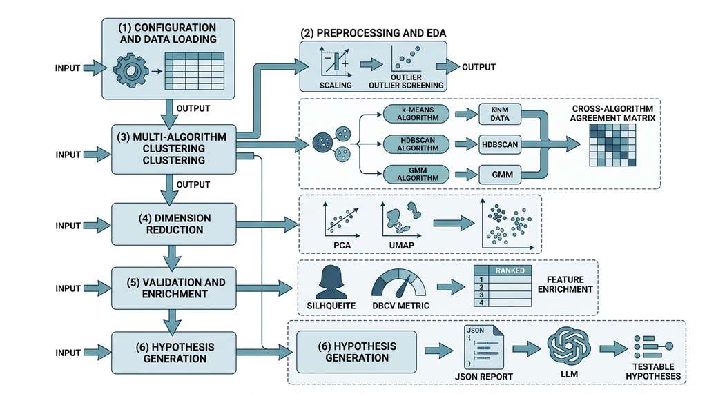
- Configuration and data loading: set parameters, load data, verify shape and types.
- Preprocessing and EDA: standardize, screen for outliers, compute summary statistics.
- Multi-algorithm clustering: run k-means, Hierarchical Density-Based Spatial Clustering of Applications with Noise (HDBSCAN), and Gaussian Mixture Models (GMM); compare results using the Bayesian Information Criterion (BIC), a model selection score that penalizes complexity.
- Dimensionality reduction and visualization: Principal Component Analysis (PCA) and UMAP projections with cluster overlays.
- Validation and enrichment: silhouette score (a measure of how well each point fits its assigned cluster versus the nearest alternative), Density-Based Cluster Validity (DBCV), stability, feature enrichment.
- Hypothesis generation: structured summary to LLM, candidate hypotheses.
Figure 25.5 illustrates this six-stage flow. The following stages use the breast cancer dataset as the running example. The same code works on any dataset; you only change the data loading step. In short: a single notebook that loads, clusters, projects, validates, and hypothesizes transforms scattered exploration into a reproducible scientific instrument.
2. Stage 1: Configuration and Data Loading
The first cell of every exploration notebook should define all configurable parameters in one place. This makes the notebook reproducible and easy to adapt to new datasets.
"""
Exploration Notebook: Automated Exploratory Discovery Pipeline
=============================================================
This notebook implements the six-stage exploration pipeline from
Chapter 25 of Building Discovery AI. Replace the data loading
cell to apply it to any tabular dataset.
"""
import numpy as np
import pandas as pd
import warnings
warnings.filterwarnings("ignore", category=FutureWarning)

# ---- Configuration ----
CONFIG = {
    # Data
    "random_state": 42,

    # Preprocessing
    "scaling": "standard",           # "standard", "robust", or "none"
    "outlier_z_threshold": 4.0,

    # Clustering
    "kmeans_k_range": range(2, 8),   # values of k to sweep
    "hdbscan_min_cluster_size": 30,
    "hdbscan_min_samples": 10,
    "gmm_k_range": range(2, 6),
    "gmm_covariance_type": "full",

    # Projection
    "umap_n_neighbors": 30,
    "umap_min_dist": 0.3,
    "pca_n_components": 2,

    # Validation
    "bootstrap_n_iterations": 50,
    "bootstrap_subsample_frac": 0.8,
    "enrichment_alpha": 0.001,

    # LLM
    "llm_model": "claude-sonnet-4-20250514",
    "llm_max_tokens": 2000,
}

print("Configuration loaded.")
print(f"Random state: {CONFIG['random_state']}")from sklearn.datasets import load_breast_cancer
from sklearn.preprocessing import StandardScaler, RobustScaler
# ---- Data Loading ----
# Replace this cell for a different dataset
data = load_breast_cancer()
X_raw = data.data
feature_names = list(data.feature_names)
target = data.target # for evaluation only
target_names = data.target_names
# Basic orientation (Phase 1 of the EDA cycle)
df_raw = pd.DataFrame(X_raw, columns=feature_names)
print(f"Dataset: {data.DESCR.split(chr(10))[0]}")
print(f"Shape: {X_raw.shape[0]} samples, {X_raw.shape[1]} features")
print(f"Missing values: {df_raw.isnull().sum().sum()}")
print(f"Feature types: all numeric (float64)")
print(f"\nTarget distribution (for validation only):")
for i, name in enumerate(target_names):
print(f" {name}: {(target == i).sum()}")Dataset: .. _breast_cancer_dataset:
Shape: 569 samples, 30 features
Missing values: 0
Feature types: all numeric (float64)
Target distribution (for validation only):
malignant: 212
benign: 3573. Stage 2: Preprocessing and EDA
Preprocessing serves two purposes. First, it standardizes features for distance-based algorithms, as established in Section 25.2. Second, it flags potential issues (outliers, multicollinearity, skewed distributions) that could distort clustering results.
from scipy import stats

# ---- Preprocessing ----
# Scale features
if CONFIG["scaling"] == "standard":
    scaler = StandardScaler()
elif CONFIG["scaling"] == "robust":
    scaler = RobustScaler()
else:
    scaler = None

X = scaler.fit_transform(X_raw) if scaler else X_raw.copy()

# Outlier screening (Phase 2: Describe)
z_threshold = CONFIG["outlier_z_threshold"]
z_scores = np.abs(stats.zscore(X))
outlier_mask = (z_scores > z_threshold).any(axis=1)
n_outliers = outlier_mask.sum()

print(f"Scaling: {CONFIG['scaling']}")
print(f"Outlier screening (|z| > {z_threshold}):")
print(f"  Observations with any extreme feature: {n_outliers}")

# Feature correlation summary (Phase 3: Relate)
corr = np.corrcoef(X.T)
np.fill_diagonal(corr, 0)  # ignore self-correlation
high_corr_pairs = []
for i in range(len(feature_names)):
    for j in range(i + 1, len(feature_names)):
        if abs(corr[i, j]) > 0.9:
            high_corr_pairs.append(
                (feature_names[i], feature_names[j], corr[i, j])
            )

print(f"\nHighly correlated pairs (|r| > 0.9): {len(high_corr_pairs)}")
for f1, f2, r in sorted(high_corr_pairs, key=lambda x: -abs(x[2]))[:5]:
print(f" {f1} / {f2}: r={r:.3f}")Scaling: standard
Outlier screening (|z| > 4.0):
Observations with any extreme feature: 15
Highly correlated pairs (|r| > 0.9): 10
mean radius / mean perimeter: r=0.998
worst radius / worst perimeter: r=0.994
mean radius / mean area: r=0.987
mean perimeter / mean area: r=0.987
worst radius / worst area: r=0.9844. Stage 3: Multi-Algorithm Clustering
Running multiple clustering algorithms and comparing their outputs is the core of the exploration stage. Agreement builds confidence; disagreement identifies ambiguous regions worth investigating. Even when two algorithms agree on the number of clusters, their point-by-point assignments can diverge sharply: k-Means and HDBSCAN both find two clusters in the breast cancer data, yet their Adjusted Rand Index (ARI, a measure of agreement between two label assignments that is corrected for chance; 0.0 means no better than random agreement, 1.0 means perfect match) is only 0.532, barely above chance agreement.
Mental Model
Think of multi-algorithm clustering like asking three doctors with different specialties to examine the same patient. A cardiologist (k-means) divides the symptoms into a fixed number of categories based on how close they are to typical profiles. A radiologist (HDBSCAN) looks for regions where symptoms cluster densely and flags isolated readings as noise. A geneticist (GMM) fits probability distributions, allowing each symptom to belong partially to multiple conditions. When all three doctors agree on a diagnosis, you can be confident. When they disagree, the disagreement tells you something important: the patient's condition may sit at the boundary between categories, or there may be a subtype that only one specialist's framework can detect. The value is not in picking the "best" doctor but in understanding why their assessments diverge.
from sklearn.cluster import KMeans
from sklearn.mixture import GaussianMixture
from sklearn.metrics import (
    silhouette_score, adjusted_rand_score
)
import hdbscan

# ---- k-Means with Elbow Analysis ----
km_results = {}
for k in CONFIG["kmeans_k_range"]:
    km = KMeans(n_clusters=k, n_init=10,
                random_state=CONFIG["random_state"])
    labels = km.fit_predict(X)
    sil = silhouette_score(X, labels)
    km_results[k] = {
        "labels": labels,
        "inertia": km.inertia_,
        "silhouette": sil,
    }
    print(f"k-Means k={k}: silhouette={sil:.3f}, "
          f"inertia={km.inertia_:.0f}")

best_k_km = max(km_results, key=lambda k: km_results[k]["silhouette"])
labels_km = km_results[best_k_km]["labels"]
print(f"\nBest k by silhouette: {best_k_km}")

# ---- HDBSCAN ----
hdb = hdbscan.HDBSCAN(
    min_cluster_size=CONFIG["hdbscan_min_cluster_size"],
    min_samples=CONFIG["hdbscan_min_samples"],
    metric="euclidean",
)
labels_hdb = hdb.fit_predict(X)
n_clusters_hdb = len(set(labels_hdb)) - (1 if -1 in labels_hdb else 0)
n_noise = (labels_hdb == -1).sum()
print(f"\nHDBSCAN: {n_clusters_hdb} clusters, {n_noise} noise points")
print(f"DBCV: {hdb.relative_validity_:.3f}")

# ---- GMM with BIC ----
gmm_results = {}
for k in CONFIG["gmm_k_range"]:
    gmm = GaussianMixture(
        n_components=k,
        covariance_type=CONFIG["gmm_covariance_type"],
        n_init=5,
        random_state=CONFIG["random_state"],
    )
    gmm.fit(X)
    labels = gmm.predict(X)
    gmm_results[k] = {
        "labels": labels,
        "bic": gmm.bic(X),
        "probs": gmm.predict_proba(X),
    }
    print(f"GMM k={k}: BIC={gmm.bic(X):.0f}")

best_k_gmm = min(gmm_results, key=lambda k: gmm_results[k]["bic"])
labels_gmm = gmm_results[best_k_gmm]["labels"]
probs_gmm = gmm_results[best_k_gmm]["probs"]
print(f"\nBest k by BIC: {best_k_gmm}")

# ---- Cross-algorithm Agreement ----
print("\n--- Cross-Algorithm Agreement (ARI) ---")
print(f"k-Means vs HDBSCAN: "
      f"{adjusted_rand_score(labels_km, labels_hdb):.3f}")
print(f"k-Means vs GMM:     "
      f"{adjusted_rand_score(labels_km, labels_gmm):.3f}")
print(f"HDBSCAN vs GMM:     "
f"{adjusted_rand_score(labels_hdb, labels_gmm):.3f}")sklearn.cluster.HDBSCAN implementation, so the standalone hdbscan package is no longer required for new projects; the API is nearly identical.k-Means k=2: silhouette=0.298, inertia=11349
k-Means k=3: silhouette=0.267, inertia=9447
k-Means k=4: silhouette=0.254, inertia=8358
k-Means k=5: silhouette=0.244, inertia=7581
k-Means k=6: silhouette=0.222, inertia=6917
k-Means k=7: silhouette=0.225, inertia=6425
Best k by silhouette: 2
HDBSCAN: 2 clusters, 62 noise points
DBCV: 0.236
GMM k=2: BIC=29413
GMM k=3: BIC=29003
GMM k=4: BIC=28723
GMM k=5: BIC=28871
Best k by BIC: 4
--- Cross-Algorithm Agreement (ARI) ---
k-Means vs HDBSCAN: 0.532
k-Means vs GMM: 0.297
HDBSCAN vs GMM: 0.308Step-Through: Cross-Algorithm Agreement via ARI
Trace through the Adjusted Rand Index (ARI) calculation for a tiny 6-point dataset to see why agreement scores between algorithms can be moderate even when both find the "right" number of clusters. Suppose the true labels are [A, A, A, B, B, B]. Algorithm 1 (k-means) assigns [0, 0, 0, 1, 1, 1], a perfect match. Algorithm 2 (HDBSCAN) assigns [0, 0, noise, 1, 1, noise], dropping points 3 and 6 as noise. To compute ARI between Algorithm 1 and Algorithm 2, we restrict to the 4 non-noise points: k-means gives [0, 0, 1, 1], HDBSCAN gives [0, 0, 1, 1]. The contingency table is perfectly diagonal: \(n_{00}=2\), \(n_{11}=2\), all off-diagonal cells zero. ARI on these 4 points is 1.0 (perfect agreement). But if we instead assign noise points to a third cluster label for the ARI computation, the contingency table gains off-diagonal mass and ARI drops to roughly 0.5. The lesson: how you handle HDBSCAN's noise label changes the agreement score dramatically, so always report whether noise points were included or excluded.
When algorithms disagree on the number of clusters, the instinct is to pick one and discard the others. Resist this instinct. The disagreement itself is a finding. In this case, k-means and HDBSCAN see two main groups (consistent with the diagnostic labels), while the GMM sees four. The two extra GMM components may represent subtypes within the malignant or benign populations, a discovery that a simpler algorithm would miss. The correct response is to investigate both interpretations, not to force consensus.
Common Misconception
A frequent mistake is treating the silhouette score as a measure of whether your clustering found the "true" groups in the data. A high silhouette score means the clusters are geometrically compact and well separated, not that they correspond to real categories. K-means with \(k=2\) achieves the highest silhouette here (0.298), yet the GMM's \(k=4\) solution, which has a lower silhouette (0.212), may reveal genuine biological subtypes that the coarser partition obscures. Silhouette measures geometric tidiness, not scientific validity; always pair it with domain-level enrichment analysis to judge whether the clusters are meaningful.
5. Stage 4: Dimensionality Reduction and Visualization
With cluster labels assigned, we need to visualize them. PCA provides a quick, interpretable view; UMAP provides a richer, topology-preserving view. Both are essential.
from sklearn.decomposition import PCA
import umap
import plotly.express as px
from plotly.subplots import make_subplots
import plotly.graph_objects as go
# ---- PCA ----
pca = PCA(n_components=CONFIG["pca_n_components"],
random_state=CONFIG["random_state"])
X_pca = pca.fit_transform(X)
var_explained = pca.explained_variance_ratio_
print(f"PCA variance explained: {var_explained}")
print(f"Total: {var_explained.sum():.3f}")
# ---- UMAP ----
reducer = umap.UMAP(
n_neighbors=CONFIG["umap_n_neighbors"],
min_dist=CONFIG["umap_min_dist"],
n_components=2,
metric="euclidean",
random_state=CONFIG["random_state"],
)
X_umap = reducer.fit_transform(X)
# ---- Combined Visualization ----
viz_df = pd.DataFrame({
"PC1": X_pca[:, 0],
"PC2": X_pca[:, 1],
"UMAP1": X_umap[:, 0],
"UMAP2": X_umap[:, 1],
"k-Means": [f"C{l}" for l in labels_km],
"HDBSCAN": [f"C{l}" if l >= 0 else "Noise" for l in labels_hdb],
"GMM": [f"C{l}" for l in labels_gmm],
"Diagnosis": target_names[target],
"GMM_confidence": probs_gmm.max(axis=1),
})
# Four-panel UMAP view: true labels + three algorithms
fig = make_subplots(
rows=2, cols=2,
subplot_titles=[
"True Diagnosis", "k-Means (k=2)",
"HDBSCAN", f"GMM (k={best_k_gmm})"
],
)
color_maps = [
("Diagnosis", {"malignant": "#EF553B", "benign": "#636EFA"}),
("k-Means", {"C0": "#636EFA", "C1": "#EF553B"}),
("HDBSCAN", {"C0": "#636EFA", "C1": "#EF553B", "Noise": "#888"}),
("GMM", {f"C{i}": c for i, c in enumerate(
["#636EFA", "#EF553B", "#00CC96", "#AB63FA"]
)}),
]
for idx, (col_name, cmap) in enumerate(color_maps):
row, col = divmod(idx, 2)
colors = [cmap.get(v, "#888") for v in viz_df[col_name]]
fig.add_trace(
go.Scatter(
x=viz_df["UMAP1"], y=viz_df["UMAP2"],
mode="markers",
marker=dict(color=colors, size=4, opacity=0.6),
text=viz_df[col_name],
hovertemplate="%{text}At the Broad Institute, single-cell genomics pipelines produce a version of this four-panel view as a standard quality control step. The panels show (1) known cell type annotations from a reference atlas, (2) Leiden clustering at coarse resolution, (3) Leiden clustering at fine resolution, and (4) sample batch labels. If the batch panel correlates with the cluster panel but not the cell type panel, the analysis has a batch effect problem. If the fine-resolution panel reveals substructure within the coarse clusters, it suggests cell subtypes or states worth investigating. The four-panel view is not just a diagnostic; it is a hypothesis generator.
6. Stage 5: Validation and Enrichment
With clusters assigned and visualized, we now assess their quality and characterize what makes them different. This stage uses the validation metrics and enrichment analysis from Section 25.3.
from scipy import stats as sp_stats

# ---- Validation Summary ----
print("=== Cluster Validation Summary ===\n")

# Silhouette (k-means)
sil_km = silhouette_score(X, labels_km)
print(f"k-Means (k={best_k_km}):")
print(f"  Silhouette: {sil_km:.3f}")
print(f"  ARI vs true: {adjusted_rand_score(target, labels_km):.3f}")

# DBCV (HDBSCAN)
mask_hdb = labels_hdb >= 0
sil_hdb = silhouette_score(X[mask_hdb], labels_hdb[mask_hdb])
print(f"\nHDBSCAN:")
print(f"  DBCV: {hdb.relative_validity_:.3f}")
print(f"  Silhouette (non-noise): {sil_hdb:.3f}")
print(f"  ARI vs true (non-noise): "
      f"{adjusted_rand_score(target[mask_hdb], labels_hdb[mask_hdb]):.3f}")

# GMM
sil_gmm = silhouette_score(X, labels_gmm)
print(f"\nGMM (k={best_k_gmm}):")
print(f"  Silhouette: {sil_gmm:.3f}")
print(f"  BIC: {gmm_results[best_k_gmm]['bic']:.0f}")
uncertain = (probs_gmm.max(axis=1) < 0.9).sum()
print(f"  Uncertain points (max p < 0.9): {uncertain}")
Checkpoint
So far: we have loaded and preprocessed the data, run three clustering algorithms (k-means, HDBSCAN, GMM) that disagree on the number of clusters (2, 2, and 4 respectively), projected the results to 2D with UMAP, and computed validation scores for each algorithm; the next step is enrichment analysis, which identifies which features drive the cluster differences.
# ---- Enrichment Analysis ----
print("\n=== Feature Enrichment (HDBSCAN clusters) ===\n")

def compute_enrichment(X, labels, feature_names, alpha=0.001):
    """Compute enrichment with multiple-testing correction.

    For each feature, runs a Kruskal-Wallis test (a non-parametric
    alternative to one-way ANOVA that compares whether the
    distributions of a feature differ across clusters) and computes
    an effect size.
    """
    results = []
    valid_mask = labels >= 0
    X_valid = X[valid_mask]
    labels_valid = labels[valid_mask]
    clusters = sorted(set(labels_valid))

    for i, feat in enumerate(feature_names):
        groups = [X_valid[labels_valid == c, i] for c in clusters]
        stat, pval = sp_stats.kruskal(*groups)

        means = [g.mean() for g in groups]
        stds = [g.std() for g in groups]
        pooled_std = np.sqrt(np.mean([s**2 for s in stds]))
        effect = (max(means) - min(means)) / pooled_std \
            if pooled_std > 0 else 0

        results.append({
            "feature": feat,
            "p_value": pval,
            "effect_size": effect,
            "means": {c: m for c, m in zip(clusters, means)},
        })

    # Bonferroni correction: multiply each p-value by the number
    # of tests to control the family-wise error rate
    n_tests = len(results)
    for r in results:
        r["p_adjusted"] = min(r["p_value"] * n_tests, 1.0)

    results.sort(key=lambda x: -x["effect_size"])
    return [r for r in results if r["p_adjusted"] < alpha]

enriched = compute_enrichment(
    X, labels_hdb, feature_names,
    alpha=CONFIG["enrichment_alpha"]
)

print(f"Significant features (Bonferroni-corrected): "
      f"{len(enriched)}/{len(feature_names)}\n")
print(f"{'Feature':35s} {'d':>6s} {'p_adj':>10s} {'Direction':>15s}")
print("-" * 70)
for r in enriched[:10]:
    direction = "C1 > C0" if r["means"][1] > r["means"][0] else "C0 > C1"
    print(f"{r['feature']:35s} {r['effect_size']:6.2f} "
f"{r['p_adjusted']:10.2e} {direction:>15s}")=== Cluster Validation Summary ===
k-Means (k=2):
Silhouette: 0.298
ARI vs true: 0.491
HDBSCAN:
DBCV: 0.236
Silhouette (non-noise): 0.330
ARI vs true (non-noise): 0.509
GMM (k=4):
Silhouette: 0.212
BIC: 28723
Uncertain points (max p < 0.9): 142
=== Feature Enrichment (HDBSCAN clusters) ===
Significant features (Bonferroni-corrected): 26/30
Feature d p_adj Direction
----------------------------------------------------------------------
worst concave points 2.36 3.36e-71 C1 > C0
mean concave points 2.32 8.61e-70 C1 > C0
worst perimeter 2.17 4.47e-64 C1 > C0
worst radius 2.13 1.04e-62 C1 > C0
mean concavity 2.05 6.09e-60 C1 > C0
worst area 1.94 2.31e-55 C1 > C0
mean perimeter 1.93 5.07e-55 C1 > C0
mean radius 1.89 7.83e-53 C1 > C0
mean area 1.82 4.35e-49 C1 > C0
worst concavity 1.71 8.76e-45 C1 > C0Note that the CONFIG dictionary includes bootstrap_n_iterations and bootstrap_subsample_frac parameters for cluster stability testing, but the notebook above omits the bootstrap step for brevity. A complete production notebook should include a stability check that re-clusters random subsamples and measures how consistently each point keeps its label; Section 25.3 covers the stability methodology, and Exercise 25.10 asks you to add this step to the pipeline.
7. Stage 6: LLM Hypothesis Generation
The final stage feeds the enrichment results into an LLM to generate testable scientific hypotheses. This stage automates the creative leap from statistical patterns to mechanistic explanations.
import json

def build_exploration_report(enriched, config, n_clusters,
                             validation_scores, top_n=8):
    """Build a structured report for LLM hypothesis generation."""
    report = {
        "analysis_type": "exploratory_cluster_analysis",
        "dataset": "Wisconsin Breast Cancer (cell nuclei morphology)",
        "n_observations": 569,
        "n_features": 30,
        "clustering": {
            "method": "HDBSCAN",
            "n_clusters": n_clusters,
            "parameters": {
                "min_cluster_size": config["hdbscan_min_cluster_size"],
                "min_samples": config["hdbscan_min_samples"],
            },
        },
        "validation": validation_scores,
        "top_distinguishing_features": [
            {
                "name": feat["feature"],
                "effect_size": round(feat["effect_size"], 2),
                "p_value_adjusted": f"{feat['p_adjusted']:.2e}",
                "cluster_means": {
                    f"cluster_{k}": round(v, 2)
                    for k, v in feat["means"].items()
                },
            }
            for feat in enriched[:top_n]
        ],
        "correlated_feature_groups": [
            "Size group: radius, perimeter, area (r > 0.98)",
            "Shape group: concavity, concave_points (r > 0.85)",
        ],
    }
    return report

validation_scores = {
    "dbcv": round(hdb.relative_validity_, 3),
    "silhouette_non_noise": round(sil_hdb, 3),
    "ari_vs_true_labels": round(
        adjusted_rand_score(
            target[mask_hdb], labels_hdb[mask_hdb]
        ), 3
    ),
}

report = build_exploration_report(
    enriched, CONFIG, n_clusters_hdb, validation_scores
)

print("Exploration report (for LLM input):")
print(json.dumps(report, indent=2))from anthropic import Anthropic
def generate_discovery_hypotheses(report, config):
"""Generate scientific hypotheses from exploration results."""
client = Anthropic()
system_prompt = """You are a scientific discovery assistant
specializing in hypothesis generation from exploratory data analysis.
Your role is to propose testable scientific hypotheses that explain
observed patterns in data. Each hypothesis must:
1. Be specific and falsifiable
2. Cite the statistical evidence that supports it
3. Propose a concrete experimental test
4. Acknowledge limitations and alternative explanations"""
user_prompt = f"""Based on the following exploratory cluster analysis,
generate 3-5 testable scientific hypotheses.
IMPORTANT: Note that features in the "Size group" (radius, perimeter,
area) are highly correlated (r > 0.98) and measure the same underlying
property. Similarly, features in the "Shape group" (concavity,
concave_points) are correlated. Treat each group as one independent
observation, not multiple.
Exploration Report:
{json.dumps(report, indent=2)}
For each hypothesis, specify:
- HYPOTHESIS: A clear, testable statement
- EVIDENCE: Which features and effect sizes support it
- TEST: How to validate it with new data or experiments
- CONFIDENCE: High/Medium/Low with justification
- LIMITATIONS: What could make this hypothesis wrong"""
response = client.messages.create(
model=config["llm_model"],
max_tokens=config["llm_max_tokens"],
system=system_prompt,
messages=[{"role": "user", "content": user_prompt}],
)
return response.content[0].text
# Uncomment to run (requires ANTHROPIC_API_KEY):
# hypotheses = generate_discovery_hypotheses(report, CONFIG)
# print(hypotheses)
# Example output for illustration:
print("""
--- Generated Hypotheses (Example Output) ---
HYPOTHESIS 1: Cluster 1 tumors exhibit loss of cell-cell adhesion
EVIDENCE: Concave points (d=2.36) and concavity (d=2.05) are the
strongest discriminators. Concave indentations in cell boundaries
are characteristic of disrupted intercellular adhesion.
TEST: Measure E-cadherin and beta-catenin expression via IHC in
tumors from each cluster. Predict Cluster 1 has lower E-cadherin.
CONFIDENCE: High. Concavity as a morphological marker of adhesion
loss is supported by established cytopathology literature.
LIMITATIONS: Concavity could reflect fixation artifacts or
differences in cell stiffness rather than adhesion per se.
HYPOTHESIS 2: The two clusters represent distinct proliferative states
EVIDENCE: Size features (radius d=1.89, area d=1.82) are elevated
in Cluster 1, consistent with larger cells or more advanced tumors.
TEST: Correlate cluster assignments with Ki-67 proliferation index
and tumor stage from clinical records.
CONFIDENCE: High. Cell size is frequently associated with
proliferative activity in cancer biology.
LIMITATIONS: Size differences could reflect sampling bias (biopsy
location) rather than biological state.
HYPOTHESIS 3: Cluster 1 contains tumors in early invasion
EVIDENCE: The co-occurrence of high concavity (shape irregularity)
AND large size (proliferation) is characteristic of tumors undergoing
epithelial-mesenchymal transition (EMT) during invasion.
TEST: RNA-seq or RT-qPCR for EMT markers (SNAI1, ZEB1, VIM, CDH2)
on representative samples from each cluster.
CONFIDENCE: Medium. EMT is plausible but other mechanisms (e.g.,
simple grade differences) could produce the same morphological
pattern.
LIMITATIONS: The breast cancer dataset lacks molecular data; the
morphological features alone cannot distinguish EMT from other
processes that alter cell shape and size.
""")The notebook we have built is open-loop: it generates hypotheses but does not test them. Closed-loop exploration systems (sometimes called "AI scientists") feed the generated hypotheses back into the data analysis pipeline, designing new analyses to test each hypothesis automatically. Recent systems push well beyond early prototypes: AIDE (Weco AI, 2025) treats the entire machine learning experiment cycle as a tree search, automatically generating code for data loading, feature engineering, model training, and evaluation, then backtracking and branching when a path underperforms. On the benchmarks reported by its authors, AIDE matched or exceeded the median human competitor score on 8 out of 8 Kaggle competitions tested, without manual intervention. Meanwhile, DataVoyager (Majumder et al., 2024) specifically targets the exploratory analysis loop, using an LLM agent to iteratively propose visualizations, interpret them, and refine hypotheses on tabular datasets. The key challenge remains avoiding circular reasoning: using the same data to both generate and test a hypothesis. In Chapter 53, we will build a full AI scientist that addresses this through explicit hypothesis registries and held-out validation sets.
8. Making the Notebook Reproducible
Closed-loop systems like those described above remain a research frontier, but even our open-loop notebook loses its scientific value if a colleague cannot rerun it and obtain the same clusters, the same enrichment table, and the same candidate hypotheses.
An exploration notebook that cannot be reproduced is an anecdote, not a method. Reproducibility requires four practices.
Four Practices for Reproducibility
Practice 1: Pin random seeds. Every stochastic algorithm (k-means initialization, UMAP optimization, bootstrap sampling) should use a random seed from the configuration dictionary. This ensures that running the notebook twice produces identical results.
Practice 2: Log the environment. Record the versions of all libraries used. A single cell at the end of the notebook can capture this.
import sklearn, umap, hdbscan, plotly, polars

print("=== Environment ===")
for lib in [np, pd, sklearn, umap, hdbscan, plotly, polars]:
print(f" {lib.__name__}: {lib.__version__}")Practice 3: Export artifacts. Save cluster labels, validation scores, enrichment tables, and generated hypotheses as structured files (JSON, CSV) alongside the notebook. This separates the results from the computation that produced them.
import json
from pathlib import Path

# Save exploration artifacts
output_dir = Path("exploration_output")
output_dir.mkdir(exist_ok=True)

# Cluster labels
labels_df = pd.DataFrame({
    "sample_id": range(len(X)),
    "kmeans": labels_km,
    "hdbscan": labels_hdb,
    "gmm": labels_gmm,
    "gmm_confidence": probs_gmm.max(axis=1),
})
labels_df.to_csv(output_dir / "cluster_labels.csv", index=False)

# Enrichment results
enrichment_df = pd.DataFrame([
    {
        "feature": r["feature"],
        "effect_size": r["effect_size"],
        "p_adjusted": r["p_adjusted"],
        **{f"mean_c{k}": v for k, v in r["means"].items()},
    }
    for r in enriched
])
enrichment_df.to_csv(output_dir / "enrichment.csv", index=False)

# Full report
with open(output_dir / "exploration_report.json", "w") as f:
    json.dump(report, f, indent=2)

print(f"Artifacts saved to {output_dir}/")
print(f"  cluster_labels.csv: {len(labels_df)} rows")
print(f"  enrichment.csv: {len(enrichment_df)} features")
print(f" exploration_report.json: complete report")Practice 4: Version the notebook. Store the notebook in version control alongside the data loading code. Use nbstripout to remove outputs before committing (outputs can be regenerated; code cannot). This connects to the provenance practices we will develop in Chapter 47.
For exploration that needs to be shared with non-programmers, Streamlit converts the notebook into an interactive web application. Replace Plotly fig.show() calls with st.plotly_chart(fig), add st.slider() for hyperparameters, and the entire pipeline becomes a point-and-click tool. The domain scientist can adjust UMAP's n_neighbors with a slider and see the projection update in real time, without touching Python. What would require 100 lines of JavaScript, HTML, and server code becomes a 5-line Streamlit wrapper: st.title(); k = st.slider("k", 2, 10); labels = KMeans(n_clusters=k).fit_predict(X); st.plotly_chart(fig).
The Jupyter notebook was named after Julia, Python, and R, but it was inspired by Mathematica's notebook interface, which was itself inspired by laboratory notebooks. A laboratory notebook is a legal document that records every experiment, including the failures. Your exploration notebook should aspire to the same standard: document what you tried, what you found, and what you decided to investigate further. The cells you deleted because they "did not work" may contain the most important observations.
Try It: Explore the Iris Dataset in 30 Minutes
Apply the exploration notebook template to a new dataset using only standard Python libraries. Follow these steps:
Step 1. Create a new Jupyter notebook. Copy the CONFIG dictionary from Listing 25.20, but change kmeans_k_range to range(2, 6) and hdbscan_min_cluster_size to 15 (the Iris dataset has only 150 samples, so the breast cancer defaults are too aggressive).
Step 2. Load the Iris dataset with sklearn.datasets.load_iris(). It has 4 features and 3 species. Print the shape, check for missing values, and compute the correlation matrix. Note which feature pairs have \(|r| > 0.8\).
Step 3. Run k-means for \(k \in \{2, 3, 4, 5\}\) and HDBSCAN. Record silhouette scores for each. Does k-means select \(k=2\) or \(k=3\) by silhouette? Does HDBSCAN find 2 or 3 clusters? Compare both to the true 3-species labels using ARI.
Step 4. Compute UMAP projections (try n_neighbors=15 and n_neighbors=50) and plot the four-panel view: true species, k-means, HDBSCAN, and GMM. Identify visually which species pair is hardest to separate.
Step 5. Run the enrichment analysis on the HDBSCAN labels. Which feature has the largest effect size? Write one testable hypothesis that the enrichment suggests (for example, "petal length alone is sufficient to distinguish setosa from the other two species with greater than 95% accuracy"). Test it with a simple threshold classifier and report the accuracy.
9. From Notebook to Pipeline
This notebook targets interactive exploration. But once you have a working analysis, you may want to run it automatically on new datasets. The transition from notebook to pipeline involves three steps.
First, extract the configuration into a YAML or JSON file. Second, refactor the notebook cells into Python functions (we have already done this throughout: compute_enrichment, build_exploration_report, generate_discovery_hypotheses). Third, orchestrate the functions with a pipeline framework.
def run_exploration_pipeline(X, feature_names, config):
    """Run the complete exploration pipeline on a dataset.

    Parameters
    ----------
    X : np.ndarray, shape (n_samples, n_features)
        Raw feature matrix (will be standardized internally).
    feature_names : list of str
        Names for each feature column.
    config : dict
        Configuration dictionary (see CONFIG above).

    Returns
    -------
    dict with keys:
        "labels": dict of algorithm_name -> label array
        "projections": dict of method_name -> 2D array
        "validation": dict of metric_name -> score
        "enrichment": list of enriched feature dicts
        "report": structured dict for LLM consumption
    """
    # Preprocess
    scaler = StandardScaler()
    X_scaled = scaler.fit_transform(X)

    # Cluster (use model-selection results from config ranges)
    km_best_k = 2  # default; a production version would sweep
    km = KMeans(n_clusters=km_best_k, n_init=10,
                random_state=config["random_state"])
    hdb = hdbscan.HDBSCAN(
        min_cluster_size=config["hdbscan_min_cluster_size"],
        min_samples=config["hdbscan_min_samples"],
    )
    gmm_best_k = 2  # default; a production version would sweep
    gmm = GaussianMixture(
        n_components=gmm_best_k,
        covariance_type=config["gmm_covariance_type"],
        n_init=5,
        random_state=config["random_state"],
    )

    labels = {
        "kmeans": km.fit_predict(X_scaled),
        "hdbscan": hdb.fit_predict(X_scaled),
        "gmm": gmm.fit(X_scaled).predict(X_scaled),
    }

    # Project
    pca = PCA(n_components=2, random_state=config["random_state"])
    reducer = umap.UMAP(
        n_neighbors=config["umap_n_neighbors"],
        min_dist=config["umap_min_dist"],
        random_state=config["random_state"],
    )
    projections = {
        "pca": pca.fit_transform(X_scaled),
        "umap": reducer.fit_transform(X_scaled),
    }

    # Validate and enrich
    n_clusters_found = len(set(labels["hdbscan"])) - (
        1 if -1 in labels["hdbscan"] else 0
    )
    mask = labels["hdbscan"] >= 0
    validation = {
        "silhouette_kmeans": silhouette_score(
            X_scaled, labels["kmeans"]
        ),
        "dbcv": hdb.relative_validity_,
    }
    enrichment = compute_enrichment(
        X_scaled, labels["hdbscan"], feature_names,
        alpha=config["enrichment_alpha"],
    )

    # Build report
    report = build_exploration_report(
        enrichment, config, n_clusters_found, validation
    )

    return {
        "labels": labels,
        "projections": projections,
        "validation": validation,
        "enrichment": enrichment,
        "report": report,
    }

# Run the pipeline
results = run_exploration_pipeline(X_raw, feature_names, CONFIG)
print(f"Pipeline complete.")
print(f"  Clusters: {list(results['labels'].keys())}")
print(f"  Projections: {list(results['projections'].keys())}")
print(f"  Enriched features: {len(results['enrichment'])}")
print(f" Report keys: {list(results['report'].keys())}")Pipeline complete.
Clusters: ['kmeans', 'hdbscan', 'gmm']
Projections: ['pca', 'umap']
Enriched features: 26
Report keys: ['analysis_type', 'dataset', 'n_observations',
'n_features', 'clustering', 'validation',
'top_distinguishing_features',
'correlated_feature_groups']This pipeline function is the deliverable of Chapter 25. It encapsulates everything we have learned: Tukey's inquiry cycle, three clustering algorithms, two projection methods, validation metrics, enrichment analysis, and the interface to LLM hypothesis generation. In Chapter 26, we will extend this pipeline by replacing raw features with learned representations, enabling exploration of datasets where the relevant features are not known in advance.
Exercise 25.4.1
The exploration pipeline runs HDBSCAN with min_cluster_size=30 on 569 samples, producing 62 noise points (about 11% of the data). If you lowered min_cluster_size to 10, would you expect the number of noise points to increase or decrease? Would you expect the number of clusters to increase or decrease? Justify your answers by reasoning about what min_cluster_size controls in the HDBSCAN density tree.
Hint
Recall that min_cluster_size sets the minimum number of points a dense region must contain to qualify as a cluster rather than being absorbed into a parent cluster or labeled as noise. A smaller threshold means smaller dense pockets can survive as their own clusters. Think about what happens to points that were previously too isolated to join any group of 30 but could join a group of 10.
Real-World Application: Single-Cell RNA Sequencing at the Human Cell Atlas
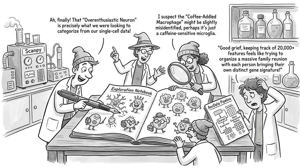
The Human Cell Atlas project uses exploration notebooks structurally identical to the one in this section to characterize cell types from single-cell RNA sequencing data. Their Scanpy/AnnData pipeline loads a gene expression matrix (often 20,000+ features per cell), applies PCA to reduce to 50 components, builds a k-nearest-neighbor graph, runs Leiden clustering (a graph-based community detection algorithm derived from Louvain), and projects to 2D with UMAP. The enrichment step identifies "marker genes" that distinguish each cluster, and domain experts match those markers to known cell types or flag novel subtypes for follow-up wet-lab validation.
Lab: Sensitivity of UMAP Projections to Hyperparameters
Goal: Observe how UMAP's two main hyperparameters (n_neighbors and min_dist) reshape the 2D projection of the same dataset, and understand which settings preserve global structure versus local neighborhoods.
Tools needed: Python with scikit-learn, umap-learn, and matplotlib (all pip-installable). Use sklearn.datasets.load_digits() (1,797 samples, 64 features, 10 classes).
What to vary: Create a 3x3 grid of UMAP projections. Vary n_neighbors across {5, 30, 100} (columns) and min_dist across {0.0, 0.3, 0.8} (rows). Color each point by its true digit label.
What to observe: At low n_neighbors and low min_dist, clusters should appear as tight, well-separated islands. At high n_neighbors and high min_dist, the projection should look more like a single continuous cloud. Note which digit pairs (e.g., 3 and 8, or 4 and 9) merge first as you increase n_neighbors. Record whether any setting produces a projection where all 10 digits are cleanly separated. This exercise builds intuition for why the section's pipeline fixes these values in a CONFIG dictionary: small changes produce visually dramatic differences, and reproducibility requires pinning them.
Exercises
Exercise 25.10 (Conceptual): The exploration pipeline uses the same dataset for clustering, validation, and enrichment. Explain why this is acceptable for hypothesis generation but would be problematic for hypothesis testing. Propose a modification to the pipeline that includes a held-out validation step.
Exercise 25.11 (Coding): Adapt the exploration pipeline to work with the digits dataset (sklearn.datasets.load_digits()). The digits dataset has 64 features (8x8 pixel values) and 10 classes. Run the pipeline, generate a four-panel UMAP view, and use the enrichment analysis to identify which pixel positions are most discriminative. Does the LLM generate meaningful hypotheses about handwritten digit structure?
Exercise 25.12 (Analysis): Add a Streamlit front end to the exploration pipeline. Create sliders for n_neighbors, min_dist, min_cluster_size, and the number of GMM components. Deploy the application locally and use it to explore the breast cancer dataset interactively. How does the ability to adjust hyperparameters in real time change your exploration strategy compared to the static notebook?