"I never start with a hypothesis. I start with a histogram. The hypothesis comes later, usually uninvited, around the third violin plot."
A Quartile With Philosophical Leanings
Exploratory Data Analysis (EDA) is not the warm-up act before modeling. It is the first genuine experiment you run on a new dataset: a structured, question-driven interrogation that reveals which variables matter, which relationships are surprising, and which assumptions your models will need to survive. This section establishes EDA as a form of scientific inquiry, introduces three modern tools for conducting it (pandas, Polars, DuckDB), and shows how the grammar of graphics turns visual exploration into a reproducible protocol.
1. Tukey's Revolution: Analysis Before Models
Consider a researcher who fits a linear model to 10,000 patient records and publishes a significant result. Only later does she discover that the outcome variable is bimodal (having two distinct peaks rather than one): two distinct populations hid in a single column, and a five-second histogram would have caught it. In 1977, John Tukey published Exploratory Data Analysis precisely to prevent this kind of blindness. Before Tukey, the workflow was rigid: specify a model, estimate its parameters, test a hypothesis. Tukey argued that this approach was backwards. If you do not know the shape of your data, any model you specify is a guess, and any hypothesis you test is a question you may not have needed to ask.
Tukey's core insight was that data analysis should be detective work, not judicial proceedings. The detective looks for clues without knowing what crime was committed. The judge evaluates evidence for a specific charge. Both are necessary, but the detective must go first. As discussed in Chapter 1, discovery is search through a space of possibilities; EDA is the reconnaissance phase that maps the terrain before you commit to a search direction.
What EDA Is, Why It Matters, and When to Use It
What. Exploratory data analysis is the systematic examination of a dataset's structure, distributions, relationships, and anomalies, conducted before formal modeling or hypothesis testing.
Why. Models encode assumptions (linearity, normality, independence). EDA reveals whether those assumptions hold. More importantly, EDA surfaces unexpected patterns that suggest new questions: the outlier cluster that turns out to be a distinct cell type, the bimodal distribution that reveals two populations mixed together, the correlation that vanishes once you condition on a third variable.
How. Through a cycle of question, visualization, computation, and refinement. Each pass sharpens the questions. The first pass asks broad questions ("What does the distribution look like?"). Later passes ask targeted ones ("Why do samples from batch 3 cluster separately?").
When. Always. Every dataset deserves an exploratory pass, whether it contains 50 rows or 50 million. The tools change with scale; the intellectual discipline does not. In short: the five-second histogram you skip today is the retracted paper you publish tomorrow.
The purpose of EDA is to generate hypotheses, not to confirm them. A pattern discovered during exploration is a candidate for further investigation, not a conclusion. This distinction matters because the same data that suggested the pattern cannot fairly test it: you need fresh data or a held-out split for confirmation. Confusing exploration with confirmation is one of the most common sources of false discoveries in data science. We will formalize this distinction in Section 25.3 when we connect cluster analysis to testable hypotheses.
2. The EDA Inquiry Cycle
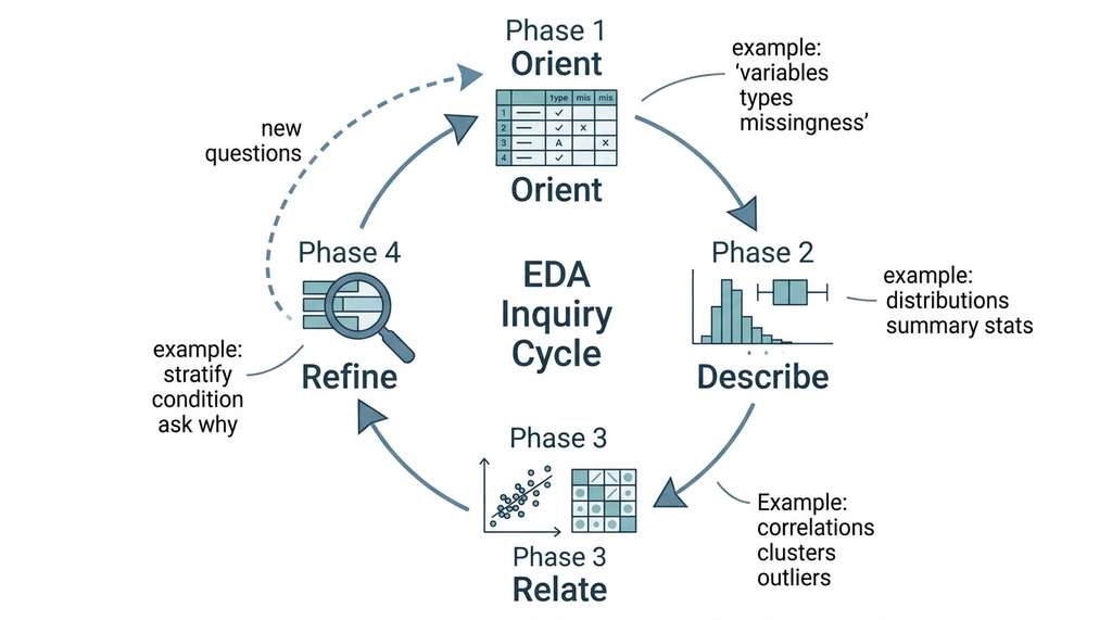
Effective EDA follows a structured cycle that mirrors the scientific method introduced in Chapter 2. The cycle has four phases, and you repeat it until you run out of questions or time. Figure 25.1 illustrates this iterative loop.
Phase 1: Orient. What are the variables? What are their types (continuous, categorical, ordinal)? How many observations? How much missingness? This is the "look before you leap" phase.
Phase 2: Describe. Compute summary statistics and visualize univariate distributions. Histograms, kernel density estimates (smooth curves that approximate a variable's probability distribution), box plots. The goal is to understand each variable in isolation.
Phase 3: Relate. Explore bivariate and multivariate relationships. Scatter plots, correlation matrices (tables showing the Pearson correlation coefficient, where r = 1 means perfect positive linear association, r = -1 means perfect negative, and r = 0 means no linear relationship), pair plots. The goal is to find associations, clusters, and outliers.
Phase 4: Refine. Ask "why?" about every surprise. Subset the data, condition on confounders (variables that influence both the predictor and the outcome, potentially creating spurious associations), compute group-wise statistics. Each answer generates new questions for the next cycle. Figure 25.1.1 illustrates EDA Inquiry Cycle.
Skipping this cycle has real consequences. In one reported case, a widely cited genomics study was retracted after reviewers discovered that batch effects in the sequencing pipeline had created artificial clusters, a problem that a single stratified box plot during Phase 2 (Describe) would have revealed before any model was trained.
The following example applies this cycle to the Wisconsin Breast Cancer dataset, a classic benchmark with 30 numeric features computed from digitized images of cell nuclei.
import pandas as pd
import numpy as np
from sklearn.datasets import load_breast_cancer

# Phase 1: Orient
data = load_breast_cancer()
df = pd.DataFrame(data.data, columns=data.feature_names)
df["diagnosis"] = pd.Categorical(
    data.target_names[data.target]  # 'malignant' or 'benign'
)

print(f"Shape: {df.shape}")
print(f"Features: {len(data.feature_names)} numeric")
print(f"Classes: {df['diagnosis'].value_counts().to_dict()}")
print(f"\nMissing values: {df.isnull().sum().sum()}")

# Phase 2: Describe (summary of key features)
summary_cols = ["mean radius", "mean texture", "mean smoothness",
                "mean compactness", "mean concavity"]
print(f"\n{df[summary_cols].describe().round(3)}")

# Phase 3: Relate (correlation among mean features)
mean_features = [c for c in df.columns if c.startswith("mean")]
corr_matrix = df[mean_features].corr()
high_corr = (corr_matrix.abs() > 0.8) & (corr_matrix != 1.0)
pairs = [(corr_matrix.index[i], corr_matrix.columns[j],
          corr_matrix.iloc[i, j])
         for i in range(len(corr_matrix))
         for j in range(i+1, len(corr_matrix))
         if high_corr.iloc[i, j]]

print(f"\nHighly correlated feature pairs (|r| > 0.8):")
for f1, f2, r in sorted(pairs, key=lambda x: -abs(x[2])):
print(f" {f1} <-> {f2}: r = {r:.3f}")Shape: (569, 31)
Features: 30 numeric
Classes: {'benign': 357, 'malignant': 212}
Missing values: 0
Highly correlated feature pairs (|r| > 0.8):
mean radius <-> mean perimeter: r = 0.998
mean radius <-> mean area: r = 0.987
mean perimeter <-> mean area: r = 0.987
mean compactness <-> mean concavity: r = 0.883
mean concavity <-> mean concave points: r = 0.921Phase 4 (Refine) asks: do these correlations hold equally within the malignant and benign subgroups? A correlation that exists only in one class is more scientifically interesting than one that is universal.
# Phase 4: Refine - check if correlations differ by diagnosis
for label in ["malignant", "benign"]:
    subset = df[df["diagnosis"] == label]
    r = subset["mean compactness"].corr(subset["mean concavity"])
print(f" Compactness-concavity correlation ({label}): r = {r:.3f}") Compactness-concavity correlation (malignant): r = 0.737
Compactness-concavity correlation (benign): r = 0.6753. Modern Tools for Exploratory Wrangling
Tukey worked with pencil and paper. We have better options. The Python ecosystem offers three distinct tools for data wrangling during EDA, each optimized for a different scale and workflow.
3.1 pandas: The Default Choice
pandas remains the most widely used DataFrame library in Python. Its API is mature, its ecosystem is vast (every plotting library speaks pandas), and for datasets under a few million rows, it is fast enough. The code in Listings 25.1 and 25.2 used pandas, and for most exploratory work, it is the right tool.
The main limitation is memory. pandas loads the entire dataset into RAM as a contiguous array, so a 10 GB CSV requires roughly 10 GB of free memory (often more, due to intermediate copies). For datasets that approach or exceed available RAM, you need a different approach.
3.2 Polars: Speed Without Complexity
Polars is a DataFrame library written in Rust that provides a pandas-like API with dramatically better performance. Three design decisions drive the speedup: lazy evaluation (Polars builds a query plan describing the operations before executing any of them), columnar memory layout (cache-friendly for analytical queries), and automatic parallelism (all CPU cores work without explicit threading).
import polars as pl

# Read the same data into Polars
df_pl = pl.DataFrame({
    name: data.data[:, i] for i, name in enumerate(data.feature_names)
})
df_pl = df_pl.with_columns(
    pl.Series("diagnosis", data.target_names[data.target])
)

# Lazy evaluation: build the query plan, then execute
result = (
    df_pl.lazy()
    .group_by("diagnosis")
    .agg([
        pl.col("mean radius").mean().alias("avg_radius"),
        pl.col("mean texture").mean().alias("avg_texture"),
        pl.col("mean concavity").mean().alias("avg_concavity"),
        pl.col("mean radius").std().alias("std_radius"),
        pl.len().alias("count"),
    ])
    .sort("diagnosis")
    .collect()  # execute the plan
)

print(result).lazy() call builds a query plan; .collect() executes it with automatic parallelism and predicate pushdown optimization (where filter conditions are moved earlier in the plan so unnecessary rows are discarded before expensive operations).shape: (2, 6)
┌────────────┬────────────┬─────────────┬───────────────┬────────────┬───────┐
│ diagnosis ┆ avg_radius ┆ avg_texture ┆ avg_concavity ┆ std_radius ┆ count │
│ --- ┆ --- ┆ --- ┆ --- ┆ --- ┆ --- │
│ str ┆ f64 ┆ f64 ┆ f64 ┆ f64 ┆ u32 │
╞═══════════╪════════════╪═════════════╪═══════════════╪════════════╪═══════╡
│ benign ┆ 12.147 ┆ 17.915 ┆ 0.046 ┆ 1.781 │ 357 │
│ malignant ┆ 17.463 ┆ 21.605 ┆ 0.161 ┆ 3.204 │ 212 │
└───────────┴────────────┴─────────────┴───────────────┴────────────┴───────┘A genomics lab receives a 4 GB CSV of single-cell RNA sequencing counts: 50,000 cells by 20,000 genes. In pandas, loading this file takes 45 seconds and consumes 12 GB of RAM (due to float64 default dtype). The same file loads in Polars in 8 seconds using 4.5 GB of RAM, because Polars infers the narrowest possible dtype and uses memory-mapped I/O. The rule of thumb: if your dataset is under 500 MB, use pandas for its richer ecosystem. If it is between 500 MB and 50 GB, Polars typically gives you 3x to 10x speedups with a similar API. Beyond 50 GB, consider DuckDB or distributed tools.
Checkpoint
So far: pandas is the default DataFrame tool for small-to-medium datasets, while Polars offers the same style of API with significantly better performance on larger files through lazy evaluation and automatic parallelism; the next tool, DuckDB, takes a different approach entirely by letting you write SQL queries directly against files and DataFrames.
3.3 DuckDB: SQL for Exploratory Analysis
DuckDB is an embedded analytical database engine. Unlike PostgreSQL or MySQL, it runs inside your Python process with no server, no configuration, and no network overhead. You query CSV files, Parquet files, and pandas DataFrames directly with SQL. For EDA, this is powerful because many exploratory questions are naturally expressed as SQL queries, especially those involving grouping, filtering, windowing, and joining.
import duckdb

# DuckDB can query pandas DataFrames directly - no import needed
result = duckdb.sql("""
    SELECT
        diagnosis,
        COUNT(*) AS n,
        AVG("mean radius") AS avg_radius,
        PERCENTILE_CONT(0.5) WITHIN GROUP
            (ORDER BY "mean concavity") AS median_concavity,
        AVG("mean radius") / AVG("mean smoothness") AS radius_smoothness_ratio
    FROM df
    GROUP BY diagnosis
    ORDER BY diagnosis
""")
print(result.df()) # convert result to pandas for displayPERCENTILE_CONT and a derived radius-to-smoothness ratio, operations that would require multiple chained pandas method calls. diagnosis n avg_radius median_concavity radius_smoothness_ratio
0 benign 357 12.146524 0.036360 126.069
1 malignant 212 17.462830 0.151700 176.988For Parquet files too large to fit in memory, DuckDB can query them directly without loading: duckdb.sql("SELECT * FROM 'measurements.parquet' WHERE temperature > 300"). This single line replaces a typical multi-step pipeline of chunked pandas reads, filters, and concatenations. DuckDB handles predicate pushdown, column pruning, and parallel scanning internally.
4. The Grammar of Graphics for Discovery
Wrangling tools prepare data for inspection, but the patterns that matter most often reveal themselves visually.
Visualization is the language of EDA. But not all visualizations are equal. A well-chosen plot answers a specific question; a poorly chosen plot hides the answer behind irrelevant decoration. The grammar of graphics (a formal system that decomposes any chart into independent, combinable layers such as data, aesthetics, and geometry), formalized by Leland Wilkinson and implemented in libraries like ggplot2 and Plotly, provides a systematic framework for mapping data to visual properties.
The grammar decomposes every chart into layers: data (the DataFrame), aesthetics (which columns map to x, y, color, size), geometry (points, lines, bars, densities), facets (subplots by category), and statistics (transformations like binning or smoothing). By thinking in these terms, you can systematically explore relationships without falling into the trap of "trying random charts until one looks interesting."
Formally, the grammar treats each visualization as a pipeline. Raw data flows through an aesthetic mapping that assigns columns to visual channels (position, color, size), then through a geometric renderer that chooses marks (points, bars, lines), and optionally through statistical transforms (binning, smoothing) and faceting (subplots by category). This composability replaces trial-and-error chart selection with principled design: each visual decision maps to a specific data property. Reach for a grammar-based library when exploring multivariate relationships; fall back to plain matplotlib for a quick single-variable histogram.
import plotly.express as px

# Scatter matrix of key features, colored by diagnosis
fig = px.scatter_matrix(
    df,
    dimensions=["mean radius", "mean texture",
                 "mean concavity", "mean symmetry"],
    color="diagnosis",
    opacity=0.5,
    title="Pairwise Feature Relationships by Diagnosis",
    labels={col: col.replace("mean ", "") for col in df.columns},
)
fig.update_traces(diagonal_visible=False, marker=dict(size=3))
fig.update_layout(width=800, height=800)
fig.show()The scatter matrix in Listing 25.5 reveals at a glance which feature pairs separate the two classes. Mean radius and mean concavity show clear separation; mean texture and mean symmetry are nearly useless alone. Notice that malignant tumors average 0.161 concavity versus 0.046 for benign, a 3.5x difference, yet this dramatic gap is invisible in any single summary statistic table and only leaps out when color encodes diagnosis in a scatter plot. This observation, which emerges in seconds from a four-line plot, would take pages of numerical summaries to convey.
Mental Model
Think of the grammar of graphics like composing a meal from independent courses rather than ordering a fixed combo. At a buffet, you choose a protein (geometry: points, bars, lines), a sauce (aesthetic mapping: which data column controls color, size, or position), a side dish (statistical transformation: raw values, binned counts, smoothed trends), and a plate arrangement (faceting: one subplot per category). Swapping the sauce does not force you to change the protein, just as changing which column maps to color does not require switching from a scatter plot to a bar chart. This composability is the mechanism that makes the grammar powerful: instead of memorizing dozens of chart types, you learn a handful of layers and combine them freely to match whatever question the data raises.
Tukey invented the box plot (he called it a "box-and-whisker plot") as a visual five-number summary: minimum, first quartile, median, third quartile, maximum. He was suspicious of means and standard deviations because they assume symmetry. The median is robust to outliers; the interquartile range (the span from the 25th to the 75th percentile, capturing the middle 50% of the data) is robust to distributional shape. Nearly 50 years later, his suspicion remains well-founded: one of the first things worth checking in EDA is whether your distributions are symmetric enough for mean-based statistics to be meaningful.
5. Systematic Anomaly Screening
While the grammar of graphics equips you to see patterns, it is equally important to spot the observations that do not fit any pattern at all.
Every dataset contains surprises. Some are errors (a temperature reading of negative 1000 degrees). Some are genuine anomalies (a cell with gene expression levels ten standard deviations above the mean). EDA must distinguish between the two, because errors corrupt your models while genuine anomalies may be the most interesting observations in the dataset.
A systematic screening protocol begins with univariate outlier detection, progresses to multivariate methods, and finishes with domain-specific sanity checks.
Common Misconception
A widespread misconception is that EDA outlier screening means identifying extreme values and removing them before modeling. In reality, removal is the last resort, not the default action. The purpose of screening is to investigate outliers: determine whether each one reflects a measurement error (fix or discard), a data entry mistake (correct), or a genuine extreme observation (keep, and consider whether your model can handle it). Automatically deleting points beyond a z-score threshold discards exactly the observations that may carry the most scientific information, such as rare disease subtypes or unusual experimental conditions.
from scipy import stats

# Univariate screening: flag features with extreme values
def screen_outliers(df, features, z_threshold=4.0):
    """Flag observations with |z-score| > threshold in any feature."""
    results = {}
    for feat in features:
        z_scores = np.abs(stats.zscore(df[feat].values))
        outlier_idx = np.where(z_scores > z_threshold)[0]
        if len(outlier_idx) > 0:
            results[feat] = {
                "count": len(outlier_idx),
                "max_z": z_scores[outlier_idx].max(),
                "indices": outlier_idx.tolist()
            }
    return results

mean_features = [c for c in df.columns if c.startswith("mean")]
outliers = screen_outliers(df, mean_features)

print("Features with extreme observations (|z| > 4.0):")
for feat, info in sorted(outliers.items(), key=lambda x: -x[1]["max_z"]):
print(f" {feat}: {info['count']} outliers, max |z| = {info['max_z']:.1f}")Features with extreme observations (|z| > 4.0):
mean area: 5 outliers, max |z| = 5.2
mean perimeter: 3 outliers, max |z| = 4.8
mean radius: 2 outliers, max |z| = 4.6
mean concave points: 1 outliers, max |z| = 4.1Univariate screening catches obvious outliers, but some anomalies are multivariate: a data point that is unremarkable on any single feature but bizarre when you consider the combination. We will address multivariate anomaly detection systematically in Chapter 30. For now, the scatter matrix from Listing 25.5 provides a visual check: points that fall outside the main clusters in multiple pairwise views deserve investigation.
6. From Visual to Computational Exploration
Visual exploration has limits. You can visualize two dimensions at a time (three with color), but real datasets have dozens or hundreds of features. Beyond five or six dimensions, scatter matrices become unwieldy, and the number of pairwise relationships grows quadratically. This is where computational methods, specifically clustering and dimensionality reduction, take over from visual inspection.
The transition from visual to computational EDA marks a shift in how we think about patterns. A histogram shows you a distribution; a clustering algorithm finds the distributions automatically. A scatter plot shows you a projection; a dimensionality reduction algorithm finds the best projection. These methods do not replace visual EDA; they extend it into spaces your eyes cannot reach.
Section 25.2 develops the mathematical foundations of clustering and dimensionality reduction, building the tools that let us explore datasets with hundreds or thousands of features as naturally as Tukey explored datasets with five.
Early large language model (LLM)-powered EDA tools like LIDA (Dibia, 2023) generated visualization code from natural-language questions but could not verify whether the output was correct. A newer generation of systems addresses this limitation through agentic loops that critique and repair their own analyses. DataInterpreter (Hong et al., 2024) decomposes an open-ended data question into a plan of dependent subtasks, generates and executes code for each step, then runs a verification stage that checks outputs against statistical invariants (column sums, row counts, distribution shape tests) before proceeding. When verification fails, the system rewrites and re-executes the code automatically. This "plan, code, verify, repair" cycle mirrors the EDA inquiry cycle from Section 2 (see Figure 25.1), but runs autonomously at machine speed. The key open challenge remains semantic grounding: the agent can verify that code runs without errors, but judging whether a visualization answers the intended question still requires human oversight. We will build a simplified version of this agentic pattern in Section 25.4.
Try It: EDA Inquiry Cycle on a New Dataset
Apply the four-phase EDA cycle to the Palmer Penguins dataset, a modern replacement for the classic Iris dataset, using only pandas, matplotlib, and scipy.
1. Orient. Install palmerpenguins (pip install palmerpenguins), load the dataset with palmerpenguins.load_penguins(), and print the shape, column types, class counts by species, and total number of missing values. Note which columns have missingness and how many rows would survive if you dropped all incomplete cases.
2. Describe. For each numeric column (bill length, bill depth, flipper length, body mass), plot a histogram faceted by species (use matplotlib subplots with three overlaid distributions per panel, one color per species). Compute the median and interquartile range for each numeric column grouped by species.
3. Relate. Create a scatter plot of bill length vs. bill depth, colored by species. Observe that the overall correlation across all species may differ in sign from the within-species correlations (a real instance of Simpson's paradox). Compute both the pooled Pearson r and the per-species Pearson r to confirm.
4. Refine. Stratify further by island. Use a grouped bar chart or a pivot table to check whether each species appears on every island or whether species and island are confounded. Discuss how this confounding would affect any model that uses both as predictors.
5. Screen. Run the z-score outlier detection function from Listing 25.6 on the numeric columns. Identify any extreme observations and look up the corresponding rows. Decide whether each outlier is likely a measurement error or a genuine biological extreme, and write a one-sentence justification for each decision.
Exercise 25.1.1
Load the breast cancer dataset (as in Listing 25.1) and compute the Pearson correlation between mean radius and mean concavity for the full dataset, then separately for the malignant and benign subgroups. Is the pooled correlation higher or lower than both within-group correlations? What does this tell you about whether the overall association is driven by the between-group difference in means rather than a genuine within-group relationship?
Hint
Compute df["mean radius"].corr(df["mean concavity"]) for all rows, then repeat on df[df["diagnosis"] == "malignant"] and df[df["diagnosis"] == "benign"]. If the pooled r is substantially higher than both within-group values, the correlation is inflated by the fact that malignant tumors have higher means on both variables, a form of Simpson's paradox.
Step-Through: The EDA Inquiry Cycle on Five Rows
Trace through the four-phase cycle with a tiny dataset of five tumors (all values are the "mean radius" and "mean concavity" features):
Data: Row A (radius=12.0, concavity=0.03, benign), Row B (radius=13.5, concavity=0.05, benign), Row C (radius=18.0, concavity=0.15, malignant), Row D (radius=20.0, concavity=0.20, malignant), Row E (radius=25.0, concavity=0.35, malignant).
Phase 1 (Orient): 5 rows, 2 numeric features, 1 categorical. Classes: 2 benign, 3 malignant. No missing values.
Phase 2 (Describe): Radius: mean = 17.7, median = 18.0, range = [12.0, 25.0]. Concavity: mean = 0.156, median = 0.15, range = [0.03, 0.35].
Phase 3 (Relate): Pearson r(radius, concavity) across all five rows = 0.997. The two features move almost perfectly together.
Phase 4 (Refine): Within benign only (rows A, B): r = 1.0 (trivially, two points). Within malignant (rows C, D, E): r = 0.999. The correlation holds within each class, so it reflects a genuine geometric relationship, not just the between-group mean difference.
Real-World Application: Genomics Quality Control at the Broad Institute
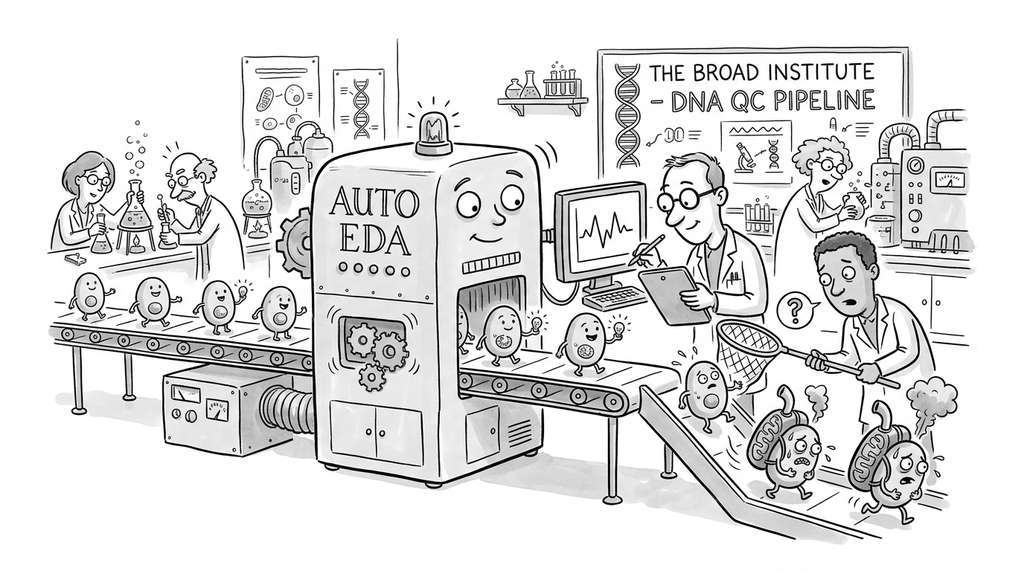
The Broad Institute's single-cell RNA sequencing pipeline uses an automated EDA pass (implemented in Scanpy) before any downstream analysis. Every new dataset is screened for three distributional anomalies: cells with abnormally high mitochondrial gene fractions (likely dying cells), genes detected in fewer than three cells (uninformative features), and cells with total transcript counts outside the 1st or 99th percentile (doublets or empty droplets). This structured EDA protocol, running the Orient/Describe/Screen cycle automatically, typically filters out 5% to 15% of observations that would otherwise distort clustering and differential expression results.
Lab: Simpson's Paradox Hunter
Goal: Find a real instance of Simpson's paradox in a tabular dataset, where a correlation reverses sign after stratifying by a categorical variable.
Tools: Python with pandas, scipy.stats, and matplotlib. Use the Palmer Penguins dataset (pip install palmerpenguins).
Procedure (15 to 20 minutes): (1) Load the dataset and compute the pooled Pearson r between bill length and bill depth across all species. (2) Compute the per-species Pearson r for the same pair. (3) Plot the scatter with all points in gray, then overlay per-species colors and per-species regression lines. (4) Repeat for at least two other numeric feature pairs to see which ones exhibit the paradox and which do not.
What to vary: Try stratifying by island instead of species. Does the paradox appear with a different grouping variable?
What to observe: The pooled correlation between bill length and bill depth is negative (about r = -0.24), but the within-species correlations are all positive (roughly r = 0.6 to 0.8). The reversal occurs because species differ in both bill length and bill depth means, and the between-group trend runs opposite to the within-group trend.
Exercises
Exercise 25.1 (Conceptual): Explain why a pattern discovered during EDA cannot be treated as a confirmed finding using the same data that revealed it. What statistical concept underlies this restriction, and what practical steps can you take to mitigate the problem?
Exercise 25.2 (Coding): Load the Iris dataset from scikit-learn. Implement the four-phase EDA cycle (Orient, Describe, Relate, Refine) using Polars instead of pandas. Compare the API ergonomics: which operations feel more natural in each library?
Exercise 25.3 (Analysis): Using DuckDB, write a single SQL query that computes, for each diagnosis class in the breast cancer dataset, the Pearson correlation between mean radius and mean concavity. Compare your result to the stratified analysis in Listing 25.2. When is SQL more expressive than pandas for EDA, and when is it less?